What Color to Paint a Bathroom With White Tile and White Fixtures
A bathroom with white tile and white fixtures looks like a blank slate. In practice it’s the opposite. The tile, tub, toilet and sink are fixed, and each one is a specific white. The paint has to agree with them, and that’s why so many “safe” colors end up looking off.
This Decorumy guide picks the bathroom paint color with white tile in the order that works. First you find out which white you have. Then you check the other things you can’t change, like grout, metal and floor. Then you test under your own bulbs. The paint type and prep are covered in our guide to refreshing a bathroom on a budget, so this article stays on color.
The best bathroom paint color with white tile depends on the tile’s undertone. Cool, bright white tile pairs with blue-grays, true blues and charcoal. Warm or cream tile and biscuit fixtures pair with greige, sage and warm whites. Either match the tile’s white closely or move clearly away from it, and test samples under your own bulbs.
Why is white tile hard to match with paint?
White tile is hard to match because no two whites are the same. Every white leans slightly toward a color, called its undertone. Some lean blue or gray and read cool. Others lean yellow, pink or beige and read warm.
Most bathrooms hold several whites at once. Glazed wall tile, a porcelain sink, an acrylic tub, white grout and white caulk can all differ. Put a paint next to them and the differences show. A wall that’s almost the same white as the tile, but not quite, tends to make the tile look dingy rather than bright.
That’s the core rule for this whole decision. Either match the tile’s white closely, or choose a color clearly different from it. The trouble zone is the near miss in between.
How do you tell if your white tile is warm or cool?
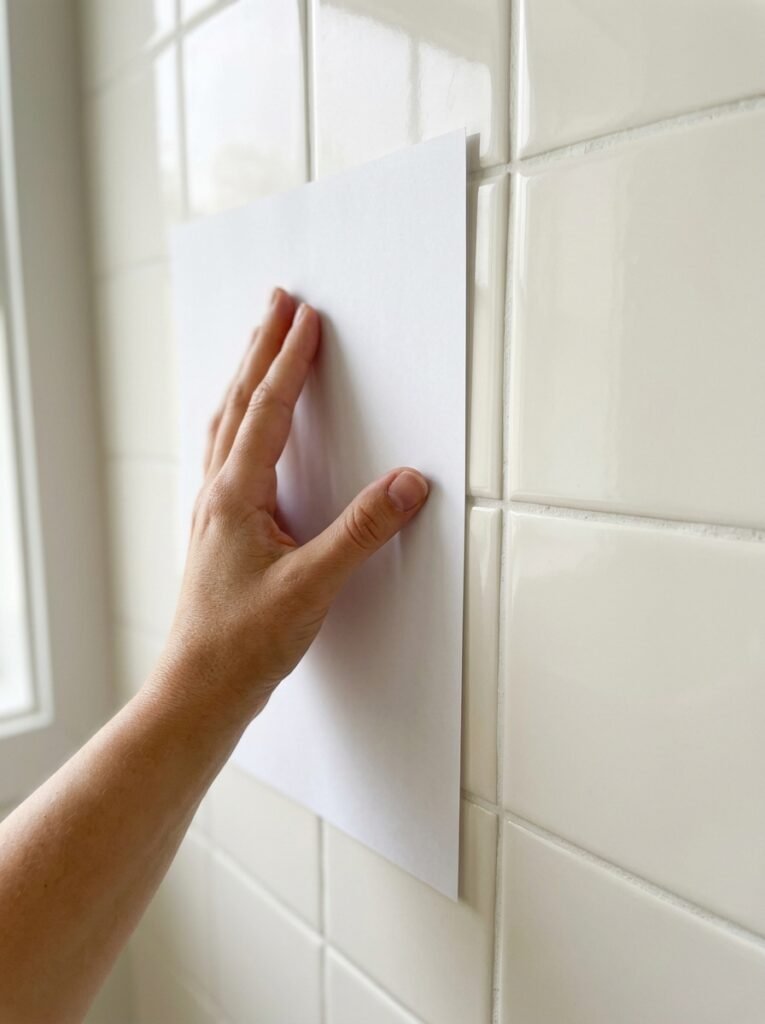
You tell whether white tile is warm or cool by comparing it to something brighter and more neutral. A sheet of plain printer paper works well. Hold it flat against the tile in daylight, with the bathroom lights off if there’s a window.
Then look at the tile, not the paper:
- If the tile looks slightly blue, gray or green next to the paper, it’s a cool white.
- If it looks creamy, yellow or pink, it’s a warm white.
- If it looks almost the same, it’s a bright neutral white.
Repeat the test on the tub, toilet and sink. Fixtures are often a different white from the tile. Some older fixtures are a distinctly cream shade called biscuit or bone, which counts as warm. When the tile and fixtures disagree, choose paint for whichever covers more of what you see from the doorway.
What paint colors go with cool white tile?
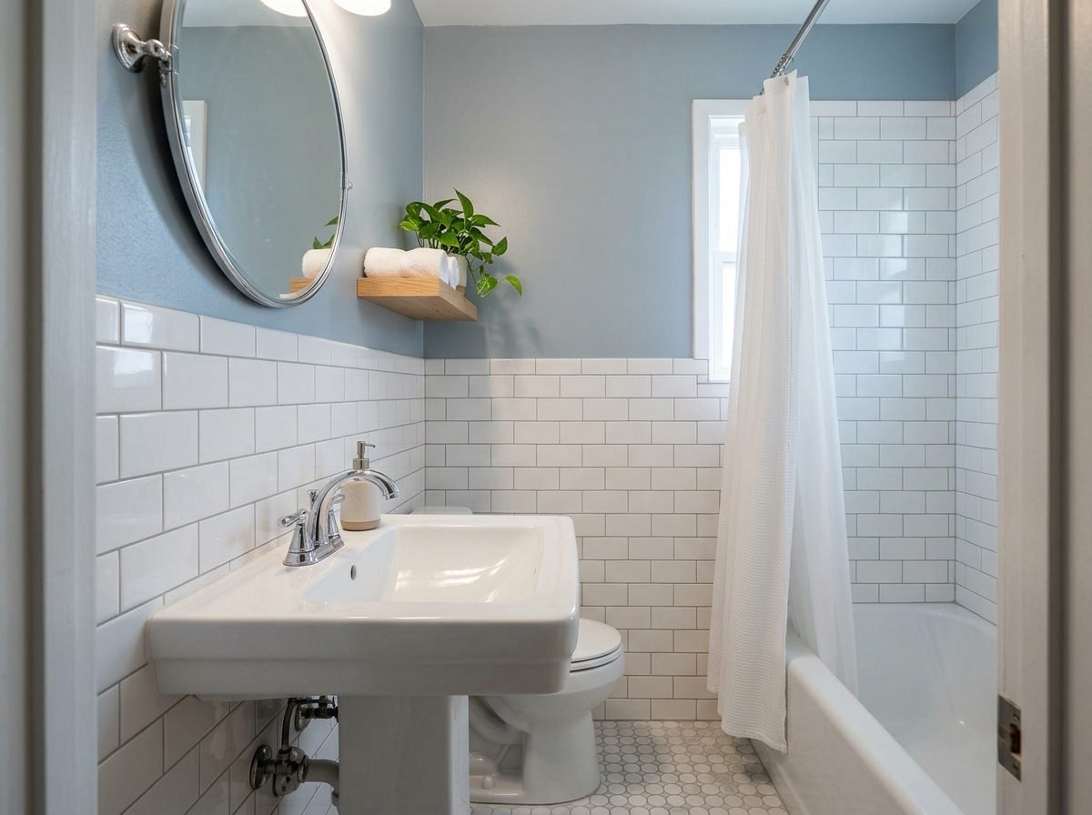
Cool white tile pairs best with colors that share its blue or gray lean. Blue-grays, soft true blues, blue-greens, crisp navy and charcoal all agree with it. A bright neutral white wall also works, as long as it’s very close to the tile.
Avoid creamy or yellow-leaning whites next to cool tile. The contrast pushes the tile toward blue, and the room can feel cold and clinical. Beige walls have the same problem in a stronger form. The tile tends to look gray, and the walls tend to look tan.
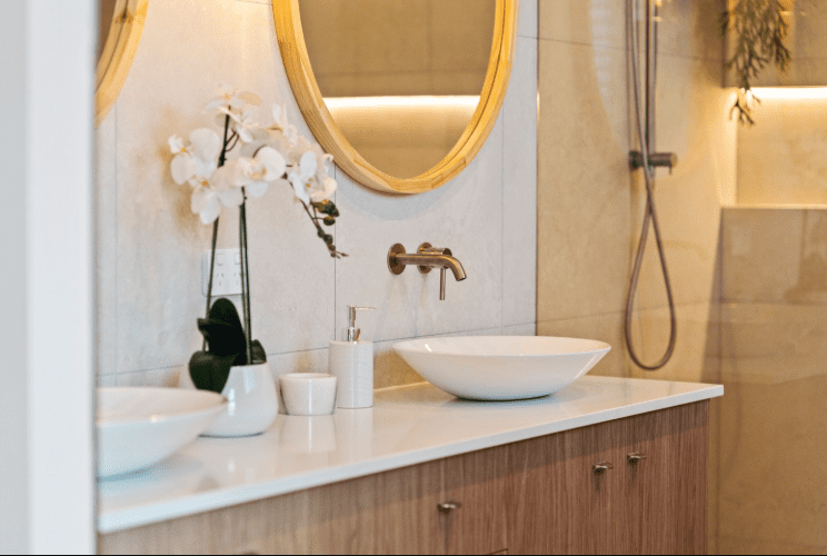
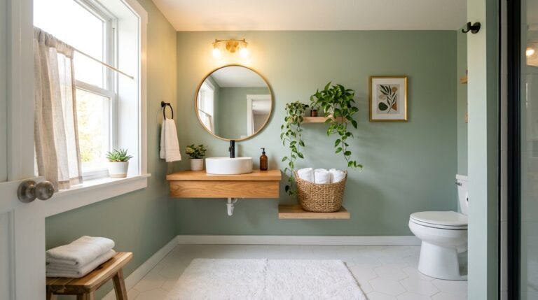
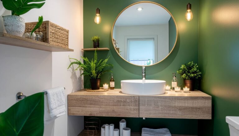
If you want warmth in a cool white bathroom, add it outside the paint. Wood shelves, a woven basket, a warm towel color or brass hardware bring warmth without fighting the tile.
What paint colors go with warm white or cream tile?
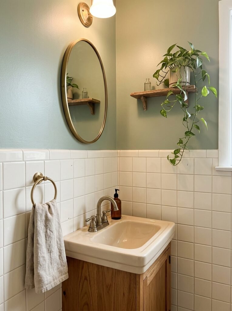
Warm white or cream tile pairs best with colors that carry a little yellow, brown or green. Greige, mushroom, soft sage, olive, warm taupe and muted terracotta all work. So do warm whites close to the tile, which make the room feel soft and even.
The color to avoid is a stark, bright white. Next to a crisp white wall, cream tile and biscuit fixtures look yellowed or dirty, even when they’re clean. Cool grays cause a similar clash. The wall reads blue and the tile reads yellow, and neither looks intended.
Warm tile can handle deeper colors well too. A deep olive, a muted clay or a warm charcoal can make cream tile look deliberate instead of dated.
Which other bathroom finishes should decide the color?
Grout, metal finish and flooring should decide the color alongside the tile. These are fixed too, and they often carry more color than the white surfaces around them.
Grout first. Gray grout adds a gray line across every tiled wall. Paint with a gray or blue-gray base agrees with it, while a creamy wall can make gray grout look like dirt. Dark grout can tie in with a darker wall color, which makes the tile pattern look intentional.
Metal finish next. Chrome and polished nickel lean cool and sit easily with blue-grays and crisp whites. Brass, gold and bronze lean warm and suit greige, sage and warm whites. Matte black works with almost any color, which makes it the safe choice if you change paint often.
Then the floor. A gray hex tile, a wood-look floor or a terracotta floor is a large color area. The wall color should relate to it as well as to the white tile above it.
How does bathroom lighting change paint color?
Bathroom lighting changes paint color more than people expect, because many bathrooms have little or no daylight. The bulbs decide how the paint looks most of the time. Warm bulbs push colors toward yellow, and cool bulbs push them toward blue.
Check the bulbs before you choose. The FTC explains that the Lighting Facts label on light bulb packages shows where a bulb falls between warm (more yellow) and cool (more blue). Make sure every bulb in the room matches. Mixed bulbs make one wall look different from the next.
Light reflectance value, or LRV, helps too. It’s a number on most paint chips or color pages that shows how much light a color reflects, on a scale from 0 (black) to 100 (white). In a windowless bathroom, a color with a higher LRV keeps the room from feeling dim. A low LRV color can still work there, but it will read darker than the chip.
Sheen changes the look as well. Benjamin Moore notes that a higher sheen creates more glare, while a flat or matte finish can look darker. On the wall behind the vanity, that glare shows up in the mirror. For which finishes hold up to steam, see the paint section of our budget bathroom guide.
How do you test bathroom paint samples properly?
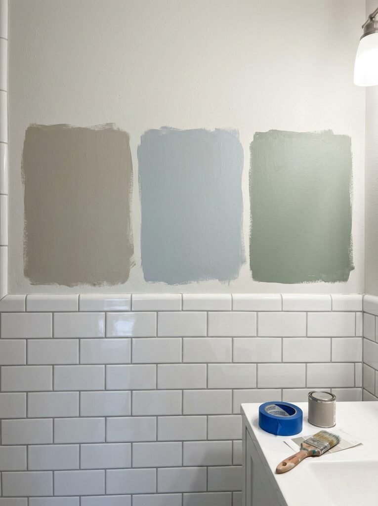
You test bathroom paint samples by painting large patches next to the tile and watching them for a few days. Small chips held in the hand don’t show how a color behaves beside glazed tile.
Follow these steps:
- Choose two or three colors from the right family for your tile.
- Paint each sample about the size of a sheet of paper, touching the edge of the tile.
- Add a second patch of each color on the wall behind the vanity.
- Look at them in the morning, at night and with the shower steam cleared.
- Stand in the doorway and judge which one makes the tile look cleanest.
Benjamin Moore suggests living with a color in your space over a few days, because it changes with the light through the day. In a bathroom, judge the samples mostly under the light you use, which is often the vanity light at night.
Should bathroom walls be lighter or darker than white tile?
Bathroom walls can be either, as long as the difference is clear. A wall that’s nearly the same white as the tile works when the match is close. A wall that’s clearly darker or clearly colored works too. The failure is a wall that’s slightly off, a little warmer or a little grayer than the tile.
Darker walls make white tile look brighter by contrast. That makes them useful in bathrooms where the tile is old but sound. Our guide to small bathroom wall decor covers using a deep accent wall in a compact room.
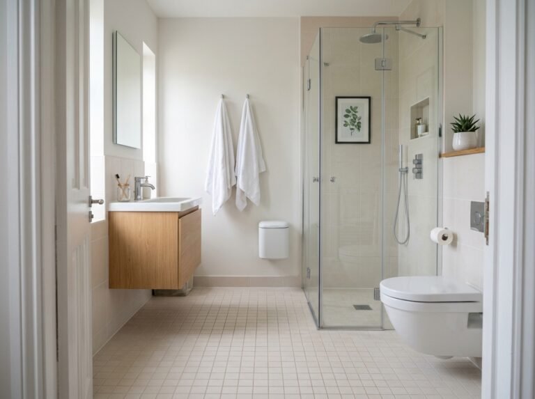
Lighter walls keep a small bathroom feeling open, especially without a window. If you go light, pick a white or near-white with the same undertone as the tile.
What colors should you avoid with white tile?
The colors to avoid are the ones that almost match. A near-white with the wrong undertone makes tile look stained. A beige next to cool tile makes both look tired. A bright stark white next to cream tile makes the tile look yellowed.
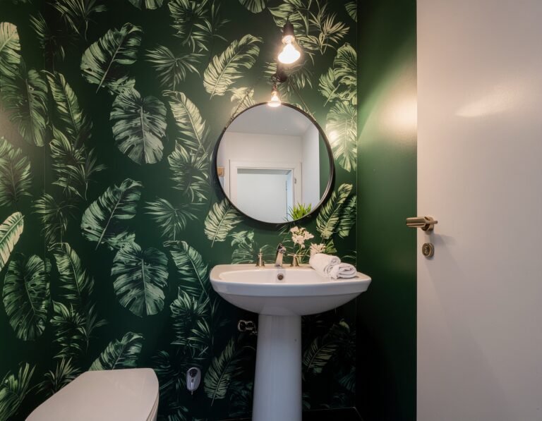
Overly saturated colors can also fight white tile in a small room. A strong, pure color bounces onto the tile, the grout and your face in the mirror. Muted versions of the same hue, with a little gray or brown in them, are easier to live with.
Paint in a damp room also needs a dry room to last. If paint is already peeling near the ceiling, deal with the moisture first. Our small bathroom guide explains why a damp bathroom isn’t ready for decorating.