The Complete Guide to Bedroom Colour Schemes
Somewhere between choosing a mattress and picking curtains, almost everyone hits the same wall. What color should the bedroom actually be? It sounds like the easy part of a redesign, yet a quick scroll through paint swatches turns into an hour of second-guessing, because unlike a kitchen or a living room, your bedroom color has to work for you at your most tired, in every kind of light, every single day of the year.
I learned this one the hard way in my first house, when I painted my bedroom a shade of gray that looked sophisticated on the little cardboard swatch and looked like a hospital corridor the moment the sun went down. It took an embarrassing amount of touch-up paint before I understood that a bedroom color scheme is not really about liking a color in isolation. It is about understanding undertone, light, mood, and how all three behave once the lights go off and the day actually ends.
This guide walks through everything worth knowing before you commit to a bedroom color scheme, from the specific palettes that consistently work to the practical steps that save you from repainting twice the way I did.
Why Your Bedroom Color Scheme Matters More Than You Think
A bedroom behaves differently than every other room in your home. You see it first thing in the morning, half awake and not exactly in a critical design mindset, and last thing at night, when you want it to feel calm rather than stimulating. Most other rooms get judged in bright daylight or under full lighting. A bedroom spends a huge share of its life in dim lamplight, streetlight glow, or near total darkness.
Color also carries a mood, and while nobody should overstate the science behind it, most people notice a real difference between waking up surrounded by a soft, muted tone and waking up surrounded by something jarring or overly bright. A bedroom that feels calm tends to support the feeling of rest the room is supposed to be for in the first place.
There is a practical angle too. Bedrooms are usually repainted far less often than living rooms, since moving the bed and clearing the space is more of a production than freshening up a hallway. Getting the color scheme right the first time saves you years of living with a choice that never quite settled.
Start With Undertones, Not Just Colors
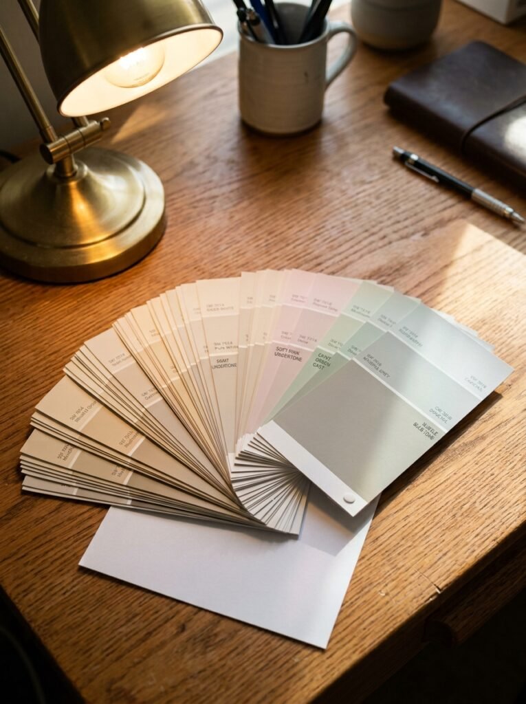
Before falling for any specific shade, it helps to understand undertones, because this single concept explains most of the disappointing paint jobs people end up living with.
Almost every color has a hidden undertone that only shows up once it is on a large wall in real light. A gray can lean blue, purple, green, or beige depending on the pigments mixed into it, and a name like “greige” or “soft dove” on the label tells you almost nothing useful about which direction it actually leans. The same goes for white, which can read warm and creamy or cold and clinical depending on its underlying tint.
The easiest way to spot an undertone is to hold your paint chip against a piece of plain white paper. The contrast reveals the hidden color almost instantly, whether that is a whisper of green in a sage-adjacent gray or a touch of pink hiding inside a warm taupe. It also helps to view the same swatch in daylight and again under a warm lamp, since undertones can shift noticeably between the two.
Understanding your room’s undertone matters more than picking a color name off a chart, because two paints called nearly identical things can feel completely different once they hit your specific walls.
Calming Blues and Soft Grays for Restful Sleep
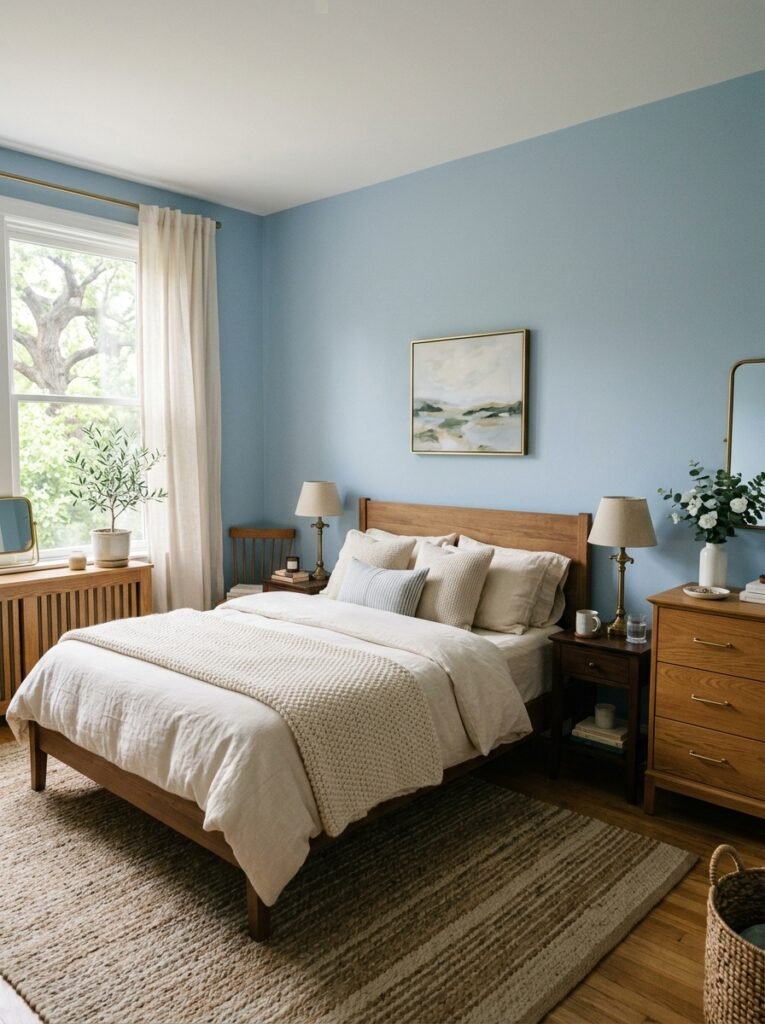
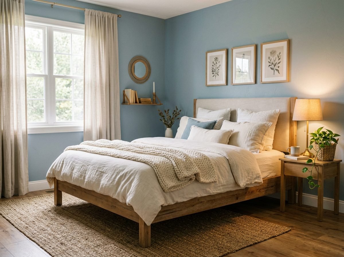
Blue remains one of the most popular bedroom colors for a simple reason. Soft, muted blues consistently read as calm, and calm is exactly what most people want from the room where they sleep.
Powder blue and dusty slate work beautifully in bedrooms with good natural light, keeping the space feeling airy without tipping into cold. In rooms with less sun, a slightly warmer blue, one with a hint of gray or green mixed in, avoids that flat, chilly feeling that a pure, saturated blue can create under weaker light.
Soft gray pairs naturally with this palette, whether as the dominant wall color with blue introduced through bedding and textiles, or the reverse. The key with any blue-gray combination is warming it up elsewhere in the room. Warm wood furniture, brass hardware, and a few cream or ivory textiles keep the palette from feeling sterile, which is the most common complaint people have about this otherwise reliable scheme.
Warm Neutrals and Earthy Tones for a Cozy Retreat
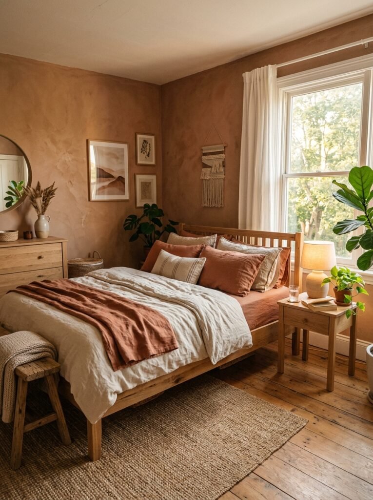
If blue leans calm and crisp, warm neutrals lean calm and cozy, which explains why this palette has become such a mainstay in bedrooms over the past several years.
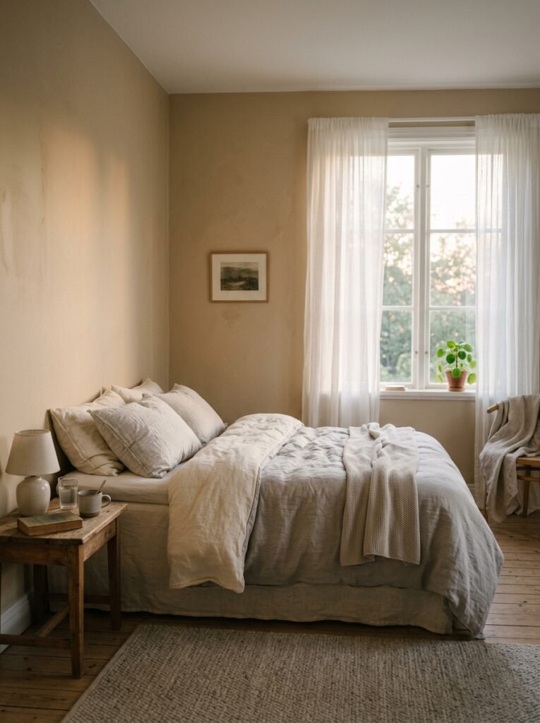
Think warm taupe, soft clay, terracotta, and creamy beige, all colors that behave more like a gentle backdrop than a bold statement. These tones flatter almost any furniture style and any amount of natural light, which makes them one of the safer choices for anyone nervous about committing to color at all.
The trick to keeping a warm neutral bedroom from feeling flat is layering in texture and slight variation rather than using one single shade everywhere. A clay-toned wall paired with a slightly lighter linen bedding and a deeper terracotta throw creates depth within the same family of color, so the room still feels rich even though nothing about it is loud.
Soft Sage and Botanical Greens for a Nature-Inspired Room
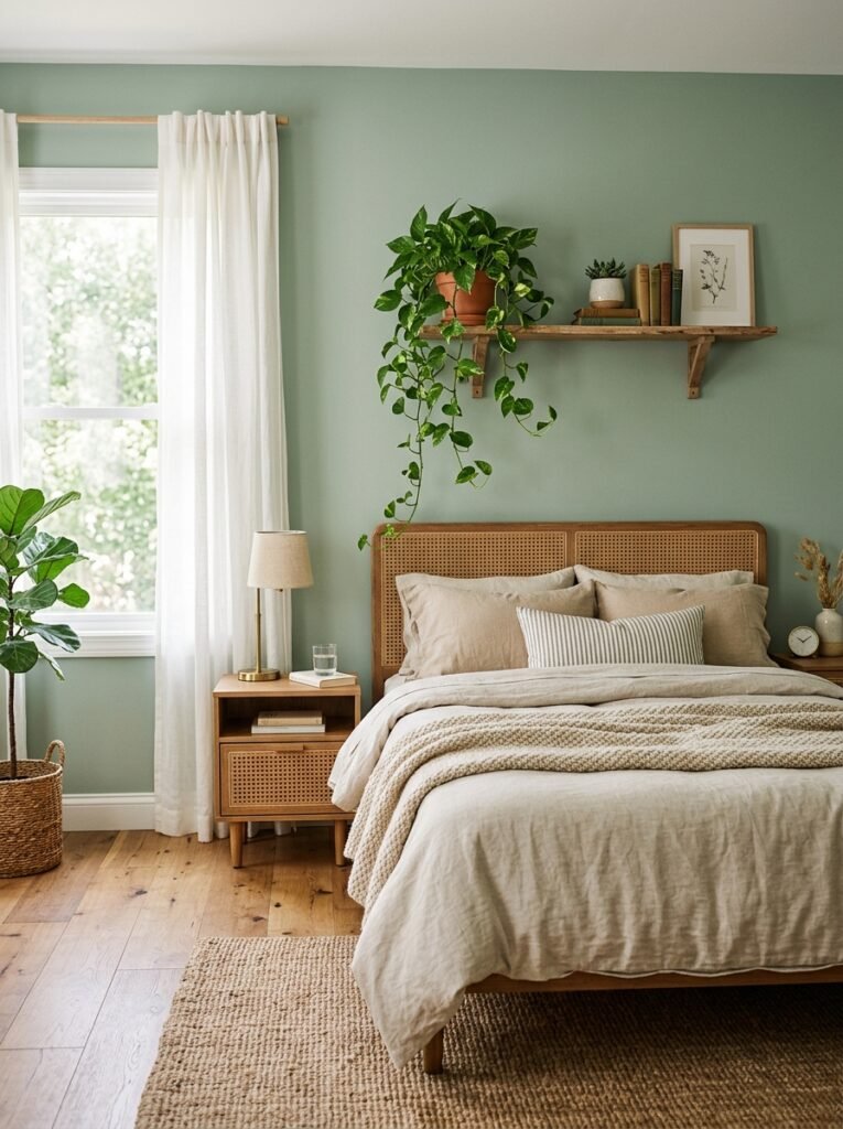
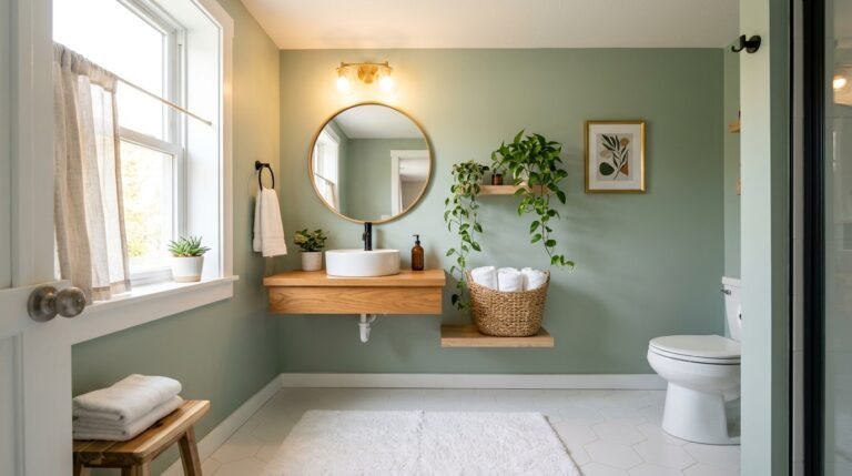
Green has moved from an occasional accent color to a genuine bedroom favorite, and muted sage in particular has become one of the most requested paint colors for exactly this room.
The appeal makes sense. Soft, grayed-down greens read as calming and grounded in a way that feels connected to nature without requiring an actual view of a garden outside the window. Sage, eucalyptus, and soft olive all sit comfortably in this category, working well against both warm and cool undertones elsewhere in the room.
This palette pairs beautifully with natural materials. Wood furniture, rattan accents, linen bedding, and a few actual plants complete the look and reinforce the organic feeling the wall color is already suggesting. Avoid pairing muted sage with anything too bright or synthetic looking nearby, since that combination undercuts the natural, restful quality that makes this scheme appealing in the first place.
Moody, Dramatic Colors Done Right
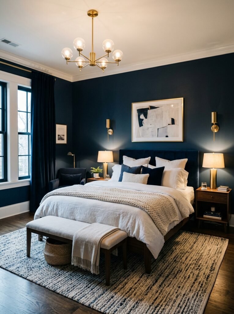
Deep, saturated colors have earned a well deserved reputation as some of the coziest bedroom choices available, despite the common fear that dark walls will make a room feel smaller or gloomier.
Navy, charcoal, deep forest green, and rich plum all work beautifully in a bedroom when handled with a little intention. The key is contrast. Pairing a dark wall with crisp white trim, light bedding, and warm lighting keeps the room feeling enveloping rather than heavy. Without that contrast, a dark room can indeed feel like it is closing in, so this is not a scheme to approach carelessly.
Lighting deserves special attention with any dark palette. Warm white bulbs and layered lamp light become even more important in a moody bedroom, since a dark room under the wrong lighting reads as gloomy rather than cozy. Metallic accents in brass or warm gold also help a dark room feel intentional and rich rather than simply dim.
Rooms with strong natural light handle dark colors especially well, since the drama of the wall color gets balanced by daylight for a good portion of the day. Rooms with little natural light can still pull this off, but leaning on warmer, less saturated dark tones, like a warm charcoal rather than a cool near-black, tends to work better.
Monochromatic Schemes That Feel Rich Rather Than Flat
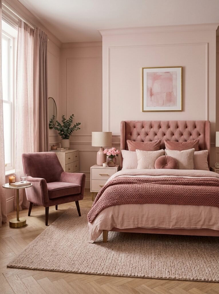
A monochromatic bedroom, built from varying shades and tones of a single color family, can feel remarkably sophisticated when done well, and remarkably flat when it is not.
The secret to avoiding the flat version lies in variation. Instead of painting every surface the exact same shade, choose several tones within one colour family, a lighter version on the walls, a medium tone in the bedding, and a deeper shade in a single accent chair or throw. This tonal layering creates depth that a single flat colour cannot achieve on its own.
Texture becomes even more important in a monochromatic room, since color variation is limited by design. Mixing matte and glossy finishes, smooth linen against a chunky knit, and a few different materials across furniture and textiles keeps the eye interested even though the palette stays tightly controlled.
This approach suits people who love a specific colour deeply, whether that is a soft blush, a warm terracotta, or a muted blue, and want their whole bedroom to feel like an extension of that single choice rather than a mix of competing tones. If blush is the colour calling to you, this step-by-step pink bedroom guide walks through exactly how to build a monochromatic room around it without it tipping into anything too sweet.
Matching Your Color Scheme to Your Room’s Light and Size
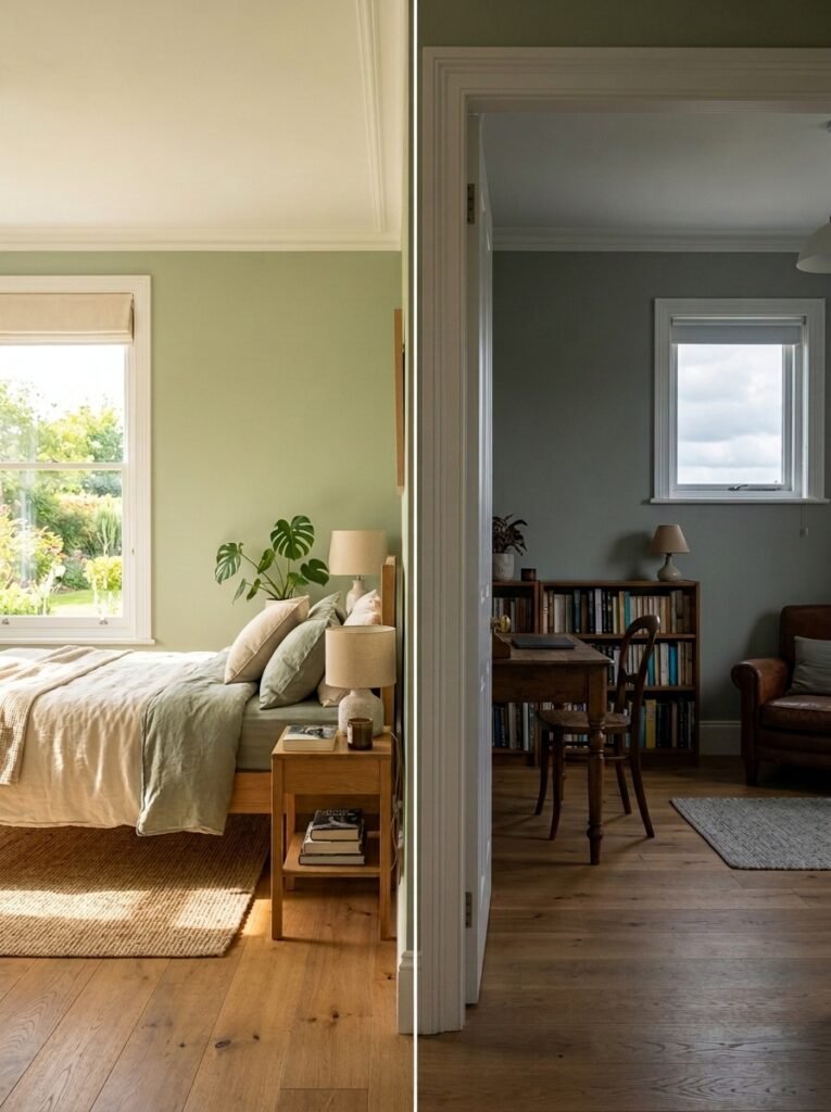
The color scheme that looks stunning in one bedroom can fall flat in another, and light is usually the reason why.
North-facing rooms tend to receive cooler, flatter light throughout the day, which means cool colors can read as somewhat gray or lifeless in that setting. Warmer versions of any color, whether that is a warmer blue, a warmer gray, or a rich terracotta, tend to compensate well in rooms that do not get much direct sun. South and west-facing rooms get warmer, more golden light, which can handle cooler tones beautifully and even benefits from them if the room tends to feel overly warm in the afternoon.
Room size matters too, though perhaps less than people assume. A small bedroom does not have to default to pale colors, since a well-lit small room in a deep, cozy color can feel intimate and inviting rather than cramped. That said, a dark, poorly lit small room may benefit from a lighter palette to avoid feeling closed in, so it is worth being honest about how much natural light your particular space actually gets before committing to a bold, dark choice.
How to Test Paint Colors Before You Commit
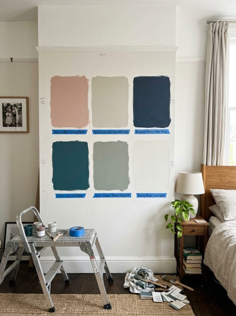
No guide about color schemes is complete without addressing the step almost everyone wants to skip, and that step is testing the color properly before painting an entire room.
Buy a small sample pot rather than trusting the tiny chip at the paint counter. Paint a section at least two feet wide on more than one wall, since light hits different walls differently throughout the day. View the sample in the morning, midday, and evening, and specifically check how it looks under your actual lamps at night, since that is when you will experience the room most often before sleep.
Pay attention to how the color interacts with your existing furniture, flooring, and any large textiles you already own and plan to keep. A color that looks beautiful on a blank wall can shift entirely once your wood furniture, rug, and curtains enter the equation.
Give yourself at least a few days living with the sample before deciding. Colors that seem perfect on day one sometimes reveal an unwanted undertone by day three, and it is far easier to notice that with a small swatch than after committing to four full walls.
Practical Tips for Choosing Your Bedroom Color Scheme
A few habits make this whole process considerably smoother and help you land on a scheme you will not want to repaint in a year.
- Test samples in more than one spot on the wall, since corners and areas near windows can look noticeably different from the center of a wall.
- Consider your bedding and existing furniture before choosing paint, since it is usually easier to match a wall color to what you already own than the reverse.
- Choose warm white bulbs for your bedroom lighting regardless of which color scheme you land on, since cool lighting flattens almost every palette.
- Repeat your chosen color at least twice in the room, through textiles or accessories, so the scheme feels intentional rather than accidental.
- If you are hesitant about committing to a bold color, start with one accent wall behind the headboard before considering all four walls.
- Photograph your test swatches at different times of day, since photos often reveal undertones the eye adjusts to and stops noticing in person.
Common Mistakes to Avoid
The most common mistake is choosing a color straight from a small paint chip without ever testing it at scale in the actual room. Paint chips are notoriously unreliable once a color covers an entire wall, and what looked calm and neutral on a two-inch square can look entirely different across sixteen feet of wall space.
Ignoring undertones is another frequent error. Choosing a gray, white, or beige purely by name rather than checking its underlying tone leads to walls that clash unexpectedly with existing furniture or flooring once the paint dries.
Skipping the lighting test trips people up constantly. A color evaluated only in bright daytime light can look completely different once evening arrives and lamps take over, which matters enormously in a room used mostly in low light.
Finally, some people go too bold too fast, painting an entire bedroom in a saturated, dramatic color without living with a sample first. A single accent wall or a smaller test area lets you gauge your real comfort with a bold choice before committing the whole room to it.
Expert Insights on Long-Term Color Choices
Interior designers who specialize in bedrooms tend to return to a few consistent pieces of advice. The first is that undertone matters more than the name on the paint can. Two colors labeled almost identically can behave completely differently on a wall, so testing in your actual space always beats trusting a label.
Designers also stress that lighting and color should be chosen together, not separately. A gorgeous wall color under the wrong bulb temperature loses much of its intended effect, while even a modest color choice looks considered under warm, well-placed light.
Another point worth remembering is that texture supports color more than people expect. A monochromatic or muted palette gains richness through varied materials, wood, linen, wool, brass, rather than through additional color alone. Professionals often reach for texture before reaching for a bolder shade when a room feels flat.
Finally, experienced designers point out that a bedroom color scheme should feel personal rather than trend-driven. The most successful bedrooms are the ones that reflect what actually makes their owner feel calm and at home, not a shade chosen purely because it appeared everywhere last season.
Frequently Asked Questions
What is the best color for a bedroom to promote relaxation?
Soft, muted tones tend to feel the most calming, including dusty blues, sage greens, and warm neutrals. The specific shade matters less than keeping it muted and paired with warm, layered lighting rather than harsh overhead light.
Should bedroom walls be light or dark?
Both can work beautifully. Light colors tend to suit smaller or darker rooms well, while dark, saturated colors can make a well-lit bedroom feel cozy and enveloping. The right choice depends more on your room’s natural light than on any universal rule.
How do I know if a paint color has a warm or cool undertone?
Hold the paint chip against a plain white piece of paper in natural daylight. The contrast usually reveals a hidden undertone, whether that is a hint of pink, green, blue, or yellow, that is not obvious when viewing the chip alone.
Can I mix two different color schemes in one bedroom?
Yes, as long as one palette leads and the other supports it in smaller doses. Combining a warm neutral base with soft sage accents, for example, works well as long as the room does not end up competing between two equally dominant schemes.
How often should I repaint my bedroom?
There is no fixed timeline, but many people find a bedroom color feels fresh for five to ten years if it was chosen thoughtfully. Testing samples properly before committing reduces the chances of wanting to repaint sooner than that.
Conclusion
Choosing a bedroom color scheme is really about understanding a handful of things at once, your room’s natural light, the undertones hiding inside every paint chip, and the mood you actually want to wake up and fall asleep in. None of the specific palettes in this guide is objectively correct. The right one is simply the one that suits your space and feels like you every time you walk into the room.
Test before you commit, pay attention to how a color behaves under lamplight as much as daylight, and layer in texture so the scheme feels rich rather than flat. Do that, and your bedroom stops being the room you keep meaning to repaint and becomes the calm, considered space it was always meant to be.