What Separates a Curated Gallery Wall From a Cluttered One
A finished gallery wall can disappoint in a very specific way. The frames sit level. The art is up. Yet the whole thing still reads closer to a noticeboard than to the composition someone had in mind. Each piece holds up alone. Together they cancel each other out.
The instinct at that point is to blame the art. That instinct is almost always wrong. A gallery wall rarely fails on the strength of its pieces. It fails because nothing connects those pieces to each other.
This guide covers why gallery walls turn chaotic and which fixes actually unify them. It also covers how to plan the next attempt, before any holes go into the plaster.
What Chaotic Actually Means on a Gallery Wall
Naming the real problem comes first. The thing people blame is rarely the thing causing the trouble.
Two assumptions dominate. One is that there is simply too much art. The other is that the pieces clash. Neither holds up. Wildly different work hangs together fine, as long as something in the arrangement repeats. Chaos comes from the absence of any repeated element: no shared color, no consistent frame, no rhythm in the gaps.
Vision works by grouping. Similar things read as a set, and so do things spaced at regular intervals. Strip out both similarity and regular spacing, and the brain finds no group to make. It then processes twelve separate objects instead of one wall. Variety is not the problem. Variety with nothing repeating is.
Pick One Unifying Thread First

One decision solves more gallery wall problems than any amount of careful measuring. It has to happen before anything goes up. That decision is which single element every piece will share.
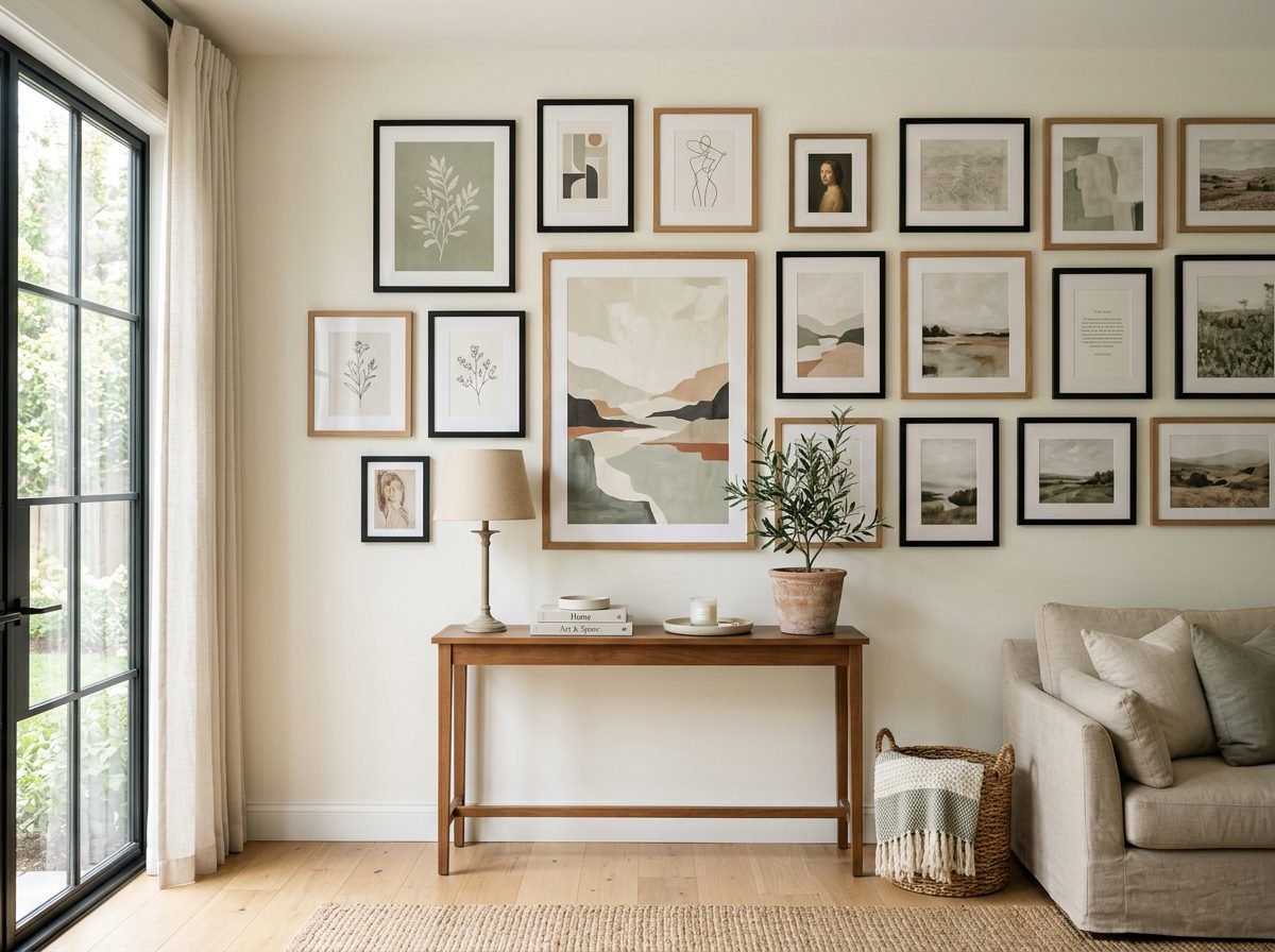
Frame finish is the easiest thread to commit to. All black, all warm wood, or all white will do it. A mismatched collection then reads as deliberate, because the repetition registers even as the art varies.
A shared palette in the art works just as well. It also suits collections that resist matching frames. Pieces drawing on the same warm neutrals cohere. So do pieces that each carry a trace of the same blue.
Subject or medium can carry the same load. All botanical prints hold together on their own. So do all black and white photographs, or all line drawings. The theme unifies the wall before the frames get a chance to interfere.
Whatever thread the wall uses, it needs to read from across the room. A shared detail visible only at half a metre does nothing. Almost nobody views a gallery wall from that distance.
Get Serious About Frame Choices
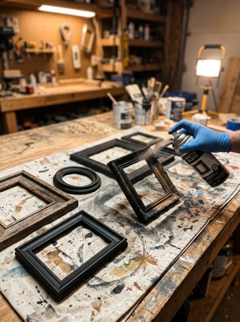
Frames carry more of the composition than most people credit. Adjusting them is also the fastest fix for a wall that already feels scattered.
Different woods, metals, and widths competing at once causes much of the noise. Replacing everything is not the answer. A tin of spray paint turns thrifted mismatches into a matte black or brass set. That takes an afternoon and very little money.
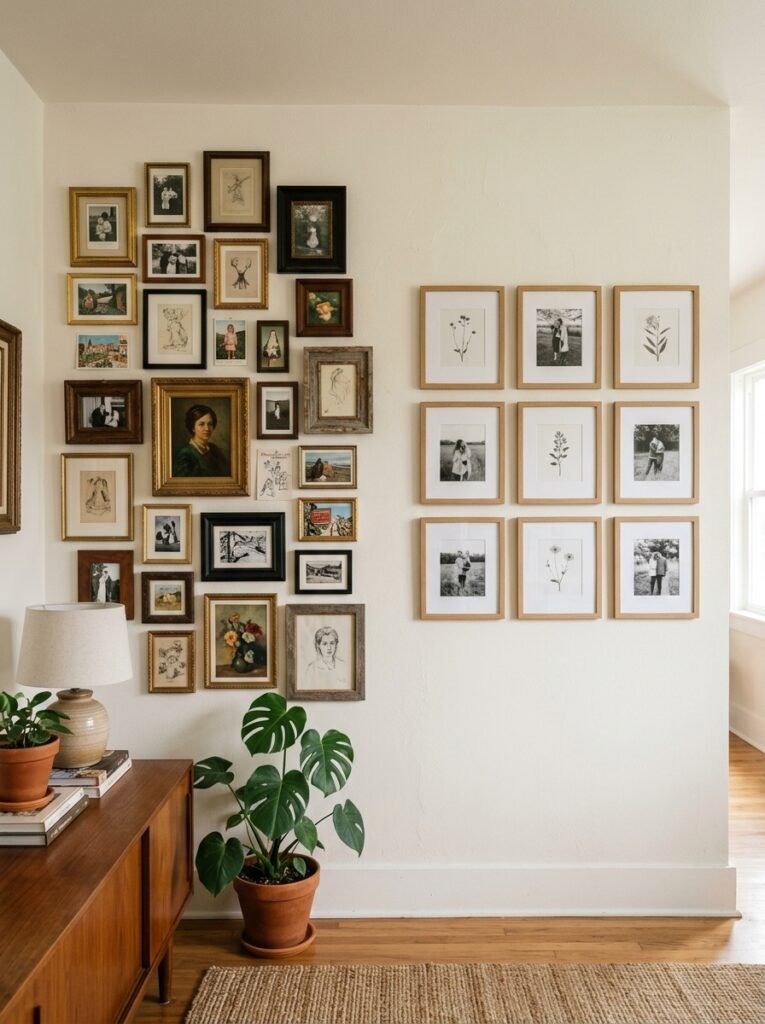
Total uniformity can feel severe. The target then becomes a controlled mix rather than a random one. Two finishes maximum, both repeated across the wall, still reads as intentional. The repetition itself becomes the pattern. Five finishes appearing once each never manage it.
Mats matter too, and not only for looks. Thick white mats beside frameless prints create an inconsistency the eye catches at once. Standardising the approach adds another quiet layer of cohesion. Material matters for anything worth keeping. The Northeast Document Conservation Center recommends pH-neutral or buffered mats, UV-filtering glazing, and glazing that never touches the artwork. Standard wood-pulp backing releases acid over time. That acid yellows a print from the edges inward.
Build a Color Story the Wall Can Follow
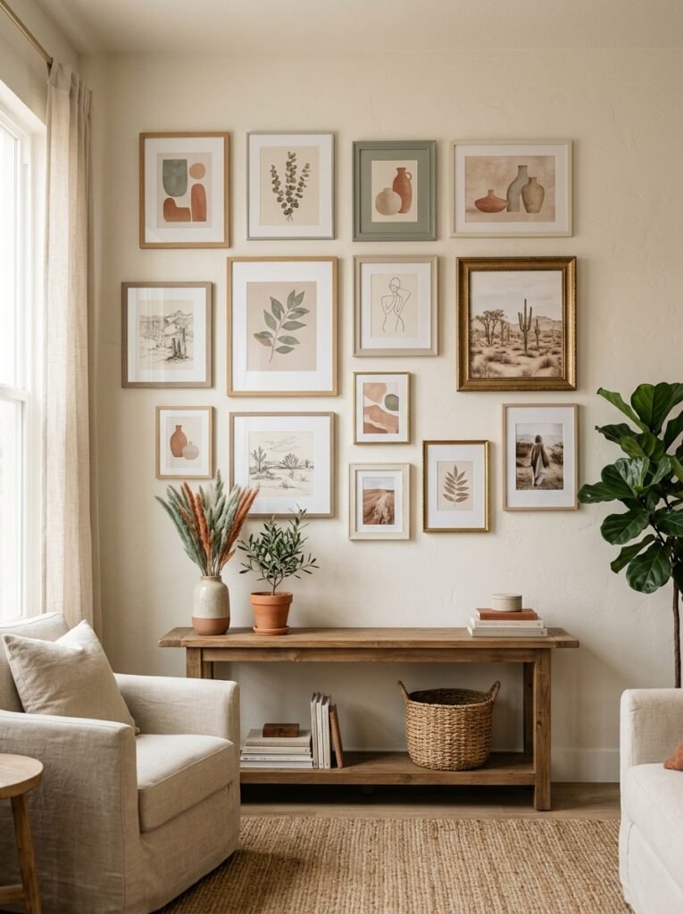
Color settles a busy wall faster than almost anything else. It works even where frames and subject matter vary widely.
Laying out the collection usually reveals a palette nobody chose on purpose. Most people gravitate toward a narrow range without noticing. That turns the job into editing rather than starting over. One jarring neon among ten muted prints will always sit outside the group, however good it is.
Some collections genuinely refuse to cohere. The wall behind them can then take over the work. A warm neutral background gives every piece a shared surround. A plain shirt does the same job for a loud skirt.
Repetition needs a minimum count. One shared tone appearing twice reads as coincidence. The same tone appearing three or four times reads as a decision. Spreading those repeats across the arrangement works better than bunching them in one corner.
Fix Your Spacing Before You Blame the Art
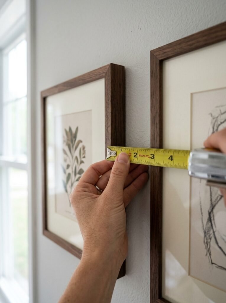
Many walls diagnosed as color or style failures are spacing failures. Uneven gaps cause a lot of the chaos. They are also among the easiest faults to correct.
Two to three inches between frames is the standard working figure. Holding close to it across the whole wall does an enormous amount of unifying. Gaps that swing from one inch to six make good art look randomly placed. The measurement runs frame edge to frame edge, not centre to centre. Mixed sizes are where people usually go wrong.
Alignment carries as much weight as the gaps. A grid produces order even from wildly different frame sizes. Tops or centres line up along invisible horizontal and vertical lines. A looser salon arrangement can look excellent too. It just needs its own internal logic, usually a fixed gap and a shared visual centre. Without that logic it slides from relaxed into careless.
Measuring the existing gaps honestly is worth doing first. Most chaotic walls improve after three or four frames move a couple of inches. Nothing needs replacing.
Plan the Layout on the Floor First
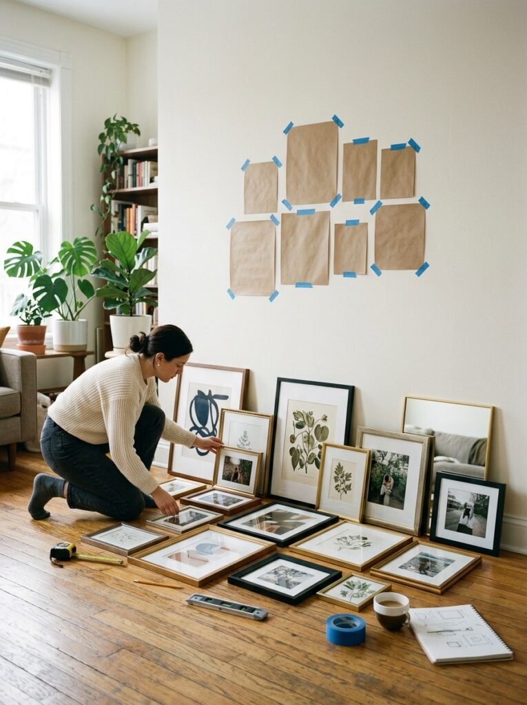
Designing a gallery wall hole by hole is the most common mistake in the process. It rarely resolves along the way. The patched plaster is the evidence.
Laying the collection out on the floor costs nothing but time. It also allows unlimited rearranging. A photograph taken from directly overhead gives a reference that stays accurate. An angled shot distorts the spacing someone just spent an hour perfecting.
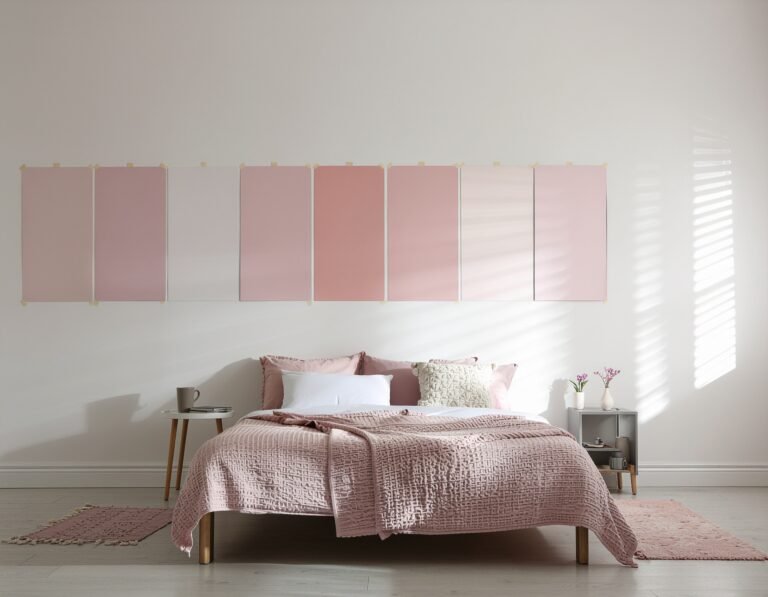
Paper templates remove most of the remaining guesswork. Tracing each frame onto craft paper takes a few minutes. Cutting the shapes out and taping them up allows adjustment from across the room. Professional installers work this way on large walls. Low-tack tape marking the outer boundary helps too, because it fixes the footprint before the internal arrangement matters.
The step feels slow in the moment. It still beats hanging everything at once, disliking it, and filling a dozen holes the following weekend. Sloping walls bring their own complications, and these staircase decor ideas cover the stairwell version.
Balance Size and Visual Weight
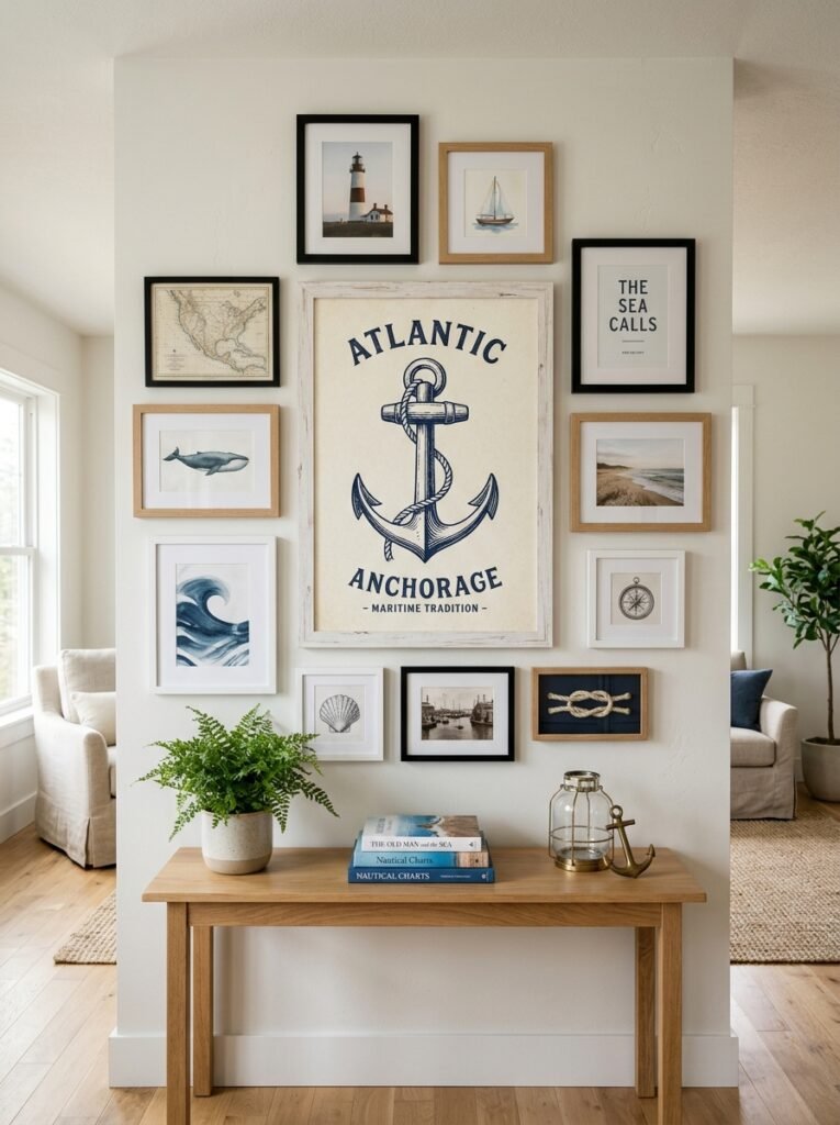
A gallery wall needs balance the way a photograph does. Scale is the factor most first attempts skip.
A cluster of identical small frames gives the eye nowhere to land. The arrangement then reads as busy and directionless. One noticeably larger piece changes that at once. It becomes the anchor. Every smaller frame around it gains a role instead of competing for the same attention.
Weight is not only a matter of dimensions. A dark, densely printed piece in a black frame outweighs a pale watercolour of identical size. Heavy pieces gathered on one side tip the whole arrangement. A badly packed case leans for the same reason.
A phone photograph converted to black and white exposes this faster than the eye does. Stripping the color out leaves only tonal weight. Any imbalance then becomes obvious. The full-color view politely disguises it. Distance matters too, since most people see the wall from across the room.
Give the Wall Room to Breathe
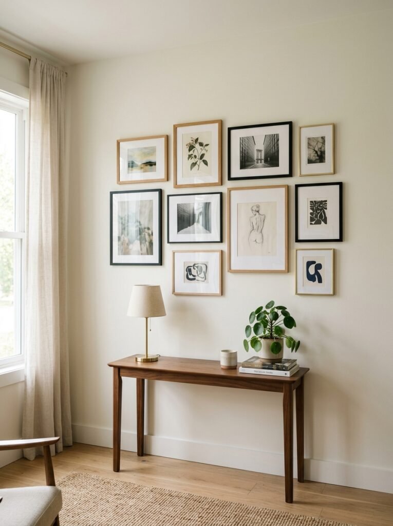
Volume causes more chaos than people expect. More art does not produce more impact. An arrangement packed edge to edge tends to overwhelm, however good the individual pieces.
A visible margin around the group lets it read as a defined shape rather than sprawl. That margin does for the arrangement what a mat does for a single print. The outer edge should also relate to whatever sits beneath it. A group above a sofa usually settles best within that furniture’s width.
Removing two or three pieces beats adding anything to a crowded wall. Editing down is the cheapest fix available. It costs only a few filled holes. Many gallery walls improve the moment something comes off.
Practical Tips for Hanging a Unified Gallery Wall
A few small habits keep the process on track from the first frame.
- Settle the unifying thread first, whether frame finish, art palette, or subject matter.
- Arrange the collection on the floor, or trace paper templates, before any nail goes in.
- Hold the gaps at two to three inches, measured edge to edge.
- Anchor the composition with one larger piece rather than a crowd of same-sized frames.
- Assess the wall from across the room, not only from arm’s length.
- Edit without sentiment. A piece that breaks the palette belongs on a different wall.
Common Mistakes to Avoid
Hanging everything at once with no plan is the most frequent error. It treats a gallery wall as an improvisation rather than a composition. Floor layouts and paper templates prevent most of the holes people later regret.
Too many frame finishes is the next error. Five woods, metals, and colors appearing once each produce noise, not eclectic charm. Two finishes, both repeated, almost always look more considered.
Inconsistent gaps undermine good art quietly. Spacing that varies across the wall registers as carelessness. Every individual piece can still be strong.
The last mistake is the counterintuitive one. Faced with a busy wall, people add more. They assume the arrangement is simply unfinished. Usually the reverse applies. Taking two pieces down does more than hanging a third.
Expert Insights on Gallery Wall Design
Designers who build these walls return to a handful of principles. The first is that constraint produces cohesion. A wall governed by one clear rule looks more curated than a wall built with no rule at all.
The second is that planning happens off the wall. Professional installers rarely improvise. An error costs patched plaster and damaged frames, which is too much to risk without a plan.
The third concerns negative space. It functions as part of the design, not as room still waiting for art. The margin and the gaps do real visual work. Treating them as carefully as the art separates a considered wall from a cluttered one.
The fourth is that these walls rarely finish in one session. The strongest ones accumulate. Pieces arrive and rotate out over time, always in service of the original thread.
Frequently Asked Questions
Why does a gallery wall look messy even when the art is good?
Because nothing repeats. The eye groups objects by similarity and by regular spacing. Without a shared frame finish, a shared palette, or consistent gaps, it reads a dozen separate items.
Do all the frames need to match?
No. Two finishes repeated across the wall beat five finishes appearing once each. The repetition registers, not the uniformity, which is why a controlled mix still looks deliberate.
How much space belongs between frames?
Two to three inches is the usual guideline. The measurement runs frame edge to frame edge, not centre to centre. Consistency across the arrangement does most of the unifying.
Is planning really necessary before hanging?
Yes. A floor layout photographed from overhead, or paper templates taped in position, allows correction before any hole exists. That saves both time and wall repair later.
Can a gallery wall hold too much art?
Easily. An arrangement packed edge to edge with no margin overwhelms, however good the pieces. Removing a few and leaving clear space around the group improves the wall more reliably.
Conclusion
A chaotic gallery wall is rarely a failure of taste. It is a missing thread. That thread might be frame finish, a shared palette, consistent spacing, or simply enough margin. Every one of those fixes works without replacing any art.
Four decisions carry the whole job. The unifying element comes first. Planning the layout comes before any hole goes in. Spacing stays steady throughout. Pieces come out rather than going in. Together those four make an existing collection read as one composition. These wall decor ideas for every room extend the same thinking elsewhere in the house.