Backsplash for busy granite countertops: how to choose one that calms the pattern
Busy granite is hard to work around. A slab full of gold, black, burgundy and gray specks already gives the eye plenty to read. Put the wrong tile above it and the whole wall starts to buzz.
The good news is that you don’t need to replace the counter. You need a backsplash that knows its job. This guide shows how to read your granite, pick the right color and finish, choose grout and avoid the mistakes that make a busy counter look busier.
The best backsplash for busy granite countertops is usually a solid, simple tile in the granite’s quietest background color, not its boldest fleck. Match the granite’s warm or cool undertone, keep the tile shape plain and choose grout close to the tile color so the backsplash reads as one calm surface.
What makes a granite countertop busy?
A busy granite countertop is one with several strong colors, high contrast between them or large swirling movement across the slab. Any one of those traits makes the counter demand attention. When a slab has all three, almost any patterned backsplash will compete with it.
It helps to name what you are looking at before you shop. Stand about 6 feet back and look at the counter for a few seconds. Then answer three questions:
- How many colors can you name? Two or three is moderate. Four or more is busy.
- How far apart are the light and dark parts? Black specks on cream are high contrast. Brown on tan is low contrast.
- Is the pattern speckled or moving? Small, even specks read as texture. Large waves, veins or circles read as pattern.
Your answers decide how quiet the backsplash needs to be. A low-contrast speckled granite can handle some texture. A high-contrast slab with big movement needs a flat, solid wall.
How do you choose a backsplash for busy granite countertops?
Choose a backsplash for busy granite countertops in three steps: pull the quietest color from the slab, confirm the undertone and then decide how much contrast the grout adds. Doing it in that order keeps you from falling for a tile in the showroom that fights the counter at home.
Step 1: Pull the background color, not the accent
Every granite has a background color and accent colors. The background is the color that covers the most area. The accents are the specks, flecks and veins sitting on top of it.
Match the backsplash to the background. If your slab is mostly cream with burgundy and black specks, look at cream and soft beige tile. If you match the burgundy instead, the tile picks up the smallest part of the pattern and makes it louder.
Aim one shade lighter than the background rather than an exact match. An exact match can make the counter and wall blur together, so the edge looks unfinished. A slightly lighter tile gives a clear line where the counter ends.
Step 2: Check the undertone
Undertone is the hidden warmth or coolness under a color. Granite with gold, beige, brown, rust or burgundy reads warm. Granite with gray, black, white, blue or green reads cool.
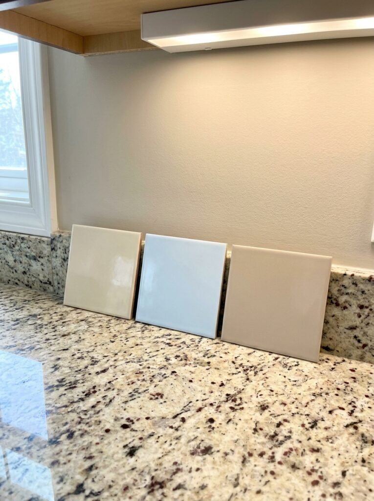
Hold a tile sample flat against the wall, right above the counter. A warm granite next to a cool, blue-white tile often looks dingy. A cool granite next to a yellow cream can look stained. If the tile makes the counter look dirty, the undertones don’t match, even when the colors seem close.
Step 3: Decide how much the grout should show
Grout draws the grid you see on the wall. Its close to the tile color hides that grid. Grout in a contrasting color turns the joints into lines, and lines add pattern. With busy granite, you usually want fewer lines, so matching grout is the safer default. The grout section below explains the exceptions.
Which backsplash colors work with common busy granites?
The right backsplash color depends on your slab’s background and undertone, so the pairings below are a starting point. Natural stone varies from slab to slab, even within one name. Always test against your own counter.
| Granite type (typical look) | Undertone | Backsplash colors to test | Colors to avoid |
|---|---|---|---|
| Santa Cecilia (gold and beige base, brown, burgundy and gray specks) | Warm | Warm cream, soft beige, light greige | Bright white, cool gray |
| New Venetian Gold (cream and gold base, burgundy and black specks) | Warm | Ivory, almond, pale sand | Blue-white, charcoal |
| Uba Tuba (very dark green and black, gold flecks) | Cool with warm flecks | Soft white, light sage, warm light gray | Busy mosaics, dark green tile |
| Baltic Brown (brown with black and round rust-colored spots) | Warm | Taupe, mushroom, warm off-white | Stark white, orange-toned tile |
| Tan Brown (dark brown and black, reddish specks) | Warm | Creamy white, light tan | Cool gray, black |
| Colonial White or Kashmir White (white and gray, garnet-colored specks) | Cool to neutral | Soft white, pale gray | Yellow cream, beige |
| Typhoon Bordeaux (cream with burgundy and gray swirls) | Warm, high movement | Plain off-white, flat finish | Any pattern, any veining |
A few patterns hold across the table. Dark, speckled granite like Uba Tuba usually looks best with a light backsplash, because the contrast lets the counter read as one solid band. Light granite with dark specks usually wants a soft white that is neither stark nor yellow. Swirling granite with big movement needs the plainest tile in the room.
If no color seems right, look at the cabinets. A backsplash can bridge the counter and the cabinets instead of matching either one. For example, a light greige tile can connect a gold granite to gray painted cabinets.
Which tile shapes and finishes stay calm next to busy granite?
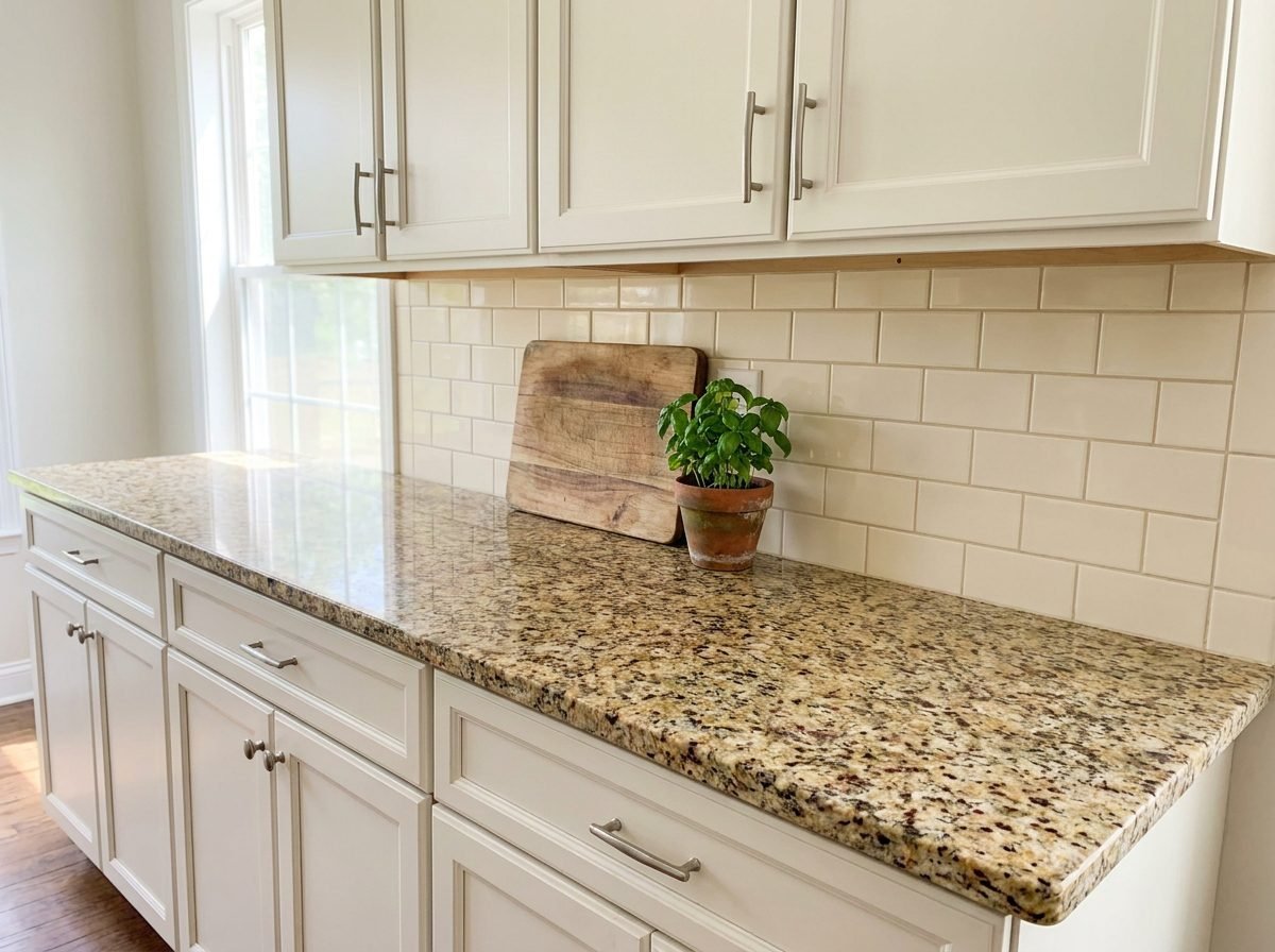
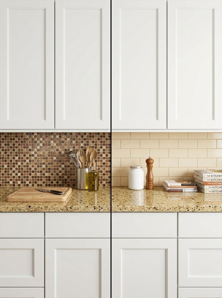
The calmest tiles next to busy granite are simple shapes in one color: subway tile, large rectangles, plain squares or a single sheet material. Simple shapes keep the grid quiet. Complex shapes add their own pattern on top of the stone.
These shapes tend to work:
- Classic subway tile (3 by 6 inches) in a running bond. Familiar, low cost and easy to keep calm with matching grout.
- Larger rectangles such as 4 by 12 or 4 by 16 inches. Fewer joints mean fewer lines.
- Stacked squares or vertical stack. Neat and modern, though the straight grid shows more than an offset one.
- Solid sheet materials. Painted back glass, a solid surface panel or a plain quartz with little pattern give you no grout lines at all.
These shapes usually fight busy granite: multicolor glass mosaics, patterned cement tile, marble-look tile with veining, penny tile in contrasting grout and herringbone in a strong color. Each one adds a second pattern. Two patterns at eye level is where most kitchens start to feel cluttered.
Handmade tile with glaze variation sits in the middle. Its color shifts are subtle and tonal, so it can work with low-contrast, speckled granite. With high-movement granite, it usually adds one layer too many. When the counter is plain, a statement tile can carry the room, as we cover in what your kitchen is missing and how to fix it. With busy granite, the counter already holds that role.
Glossy or matte?
Finish is a design preference rather than a rule, but it changes how much the backsplash competes. Polished granite already reflects light. A glossy tile repeats that shine and makes the wall feel lively. A matte or satin tile contrasts with the polished counter and lets the stone stand out more.
If your kitchen is dim, a soft gloss bounces a little more light. If the room already gets strong light, matte reduces glare on the wall behind the sink.
What grout color works with a busy granite countertop?
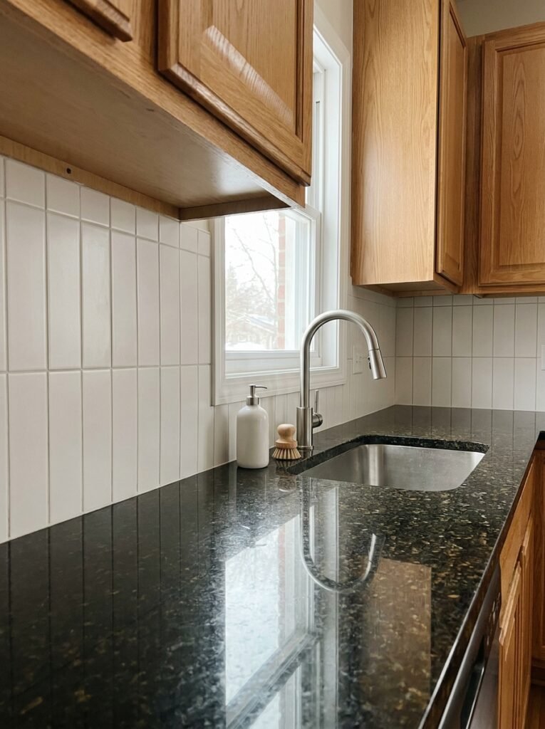
The safest grout color for a backsplash above busy granite is one that matches the tile or sits one shade darker. Matching grout blends the joints into the tile, so the wall reads as one surface. Contrasting grout turns the joints into a visible grid.
Grout maker MAPEI’s guide to choosing grout color explains the same match-or-contrast choice. It also notes that wider joints make grout color more prominent. That matters here. A narrow joint in a matching color nearly disappears. A wide joint in a dark color draws a strong grid right above the counter.
There are two practical tweaks:
- Go one shade darker than white tile. Pure white grout behind a sink or cooktop shows splatter quickly. A soft gray or warm putty still reads quiet but hides daily stains better.
- Pull a mid-tone from the granite for the grout. If the slab has a gray or taupe that is neither the lightest nor darkest color, a grout in that tone can tie wall and counter together without adding contrast.
Test the grout before you commit. Ask for a sample, or make a small board with a few tiles and two grout colors side by side. Look at it in your kitchen at night as well as during the day.
Should the backsplash stop at 4 inches, go to the cabinets or reach the ceiling?
The backsplash height depends on how much tile you want next to the granite. Many builder kitchens with granite have a 4-inch backsplash cut from the same slab. Above it, you can leave painted wall, tile up to the upper cabinets or run tile to the ceiling on walls without uppers.
Keeping the 4-inch granite splash
The 4-inch splash continues the busy pattern up the wall, which is fine if the counter is the feature. Tile the wall above it in a quiet color and treat the splash as the counter’s edge. The tile line sits on top of the splash, so keep it straight and neat.
Removing the 4-inch splash gives a cleaner look, but it is a careful job. The splash is usually glued with adhesive or silicone, and prying it off can damage drywall or chip the counter edge. If you aren’t confident, ask a countertop fabricator or tile installer to remove it.
Tiling to the upper cabinets
Tile from the counter to the underside of the upper cabinets is the most common choice. In many kitchens, that space is about 18 inches tall. A calm tile here gives the eye a rest between the busy counter and the cabinet doors.
Full-height granite slab backsplash
A full-height backsplash in the same granite doubles the pattern. With moderate granite it can look continuous and deliberate. With very busy granite, it can feel heavy, because the strongest part of the stone now sits at eye level.
If you do choose stone on the wall, care matters too. The Natural Stone Institute’s position on sealing natural stone countertops says most granite countertops do not need sealing, though many still benefit from it. Ask your fabricator about your specific slab before you seal anything.
How do cabinets and lighting change the right backsplash?
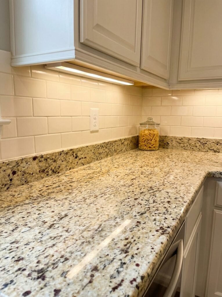
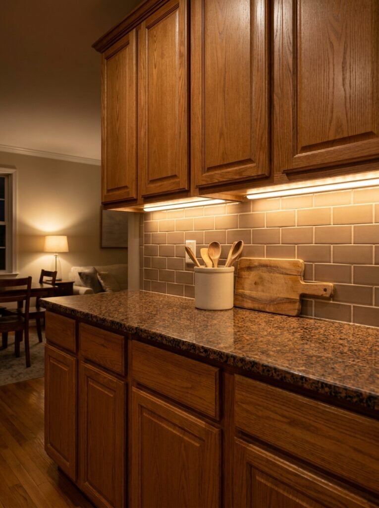
Cabinets and lighting change the backsplash choice because they change how the granite looks. A tile that works under daylight can look yellow under warm bulbs. A tile that matches the counter may clash with the cabinets above.
Working with cabinet color
Treat the counter, backsplash and cabinets as three layers. In most kitchens with busy granite, only one of them should be loud, and the counter has already taken that role.
- White or cream cabinets: pick a backsplash close to the cabinet color. The wall and doors then frame the granite as one quiet block.
- Wood cabinets: pick a backsplash pulled from the granite’s background, so the tile bridges stone and wood.
- Dark painted cabinets: a light backsplash keeps the middle of the wall from turning into a dark band.
If you’re also rethinking the overall look, our guide to kitchen decor ideas by style shows how each style handles materials, so the backsplash suits the direction of the room.
Testing under your bulbs
The color of your light bulbs shifts how granite and tile look. The U.S. Department of Energy’s guide to bulb color temperature lists 2,700 K as warm and 3,000 K as soft, with higher numbers looking cooler. Warm light deepens gold and brown granite. Cooler light pushes cream tile toward white.
The same guide explains color rendering index, or CRI, a 0 to 100 scale of how accurately light shows colors. A higher CRI shows granite more truly. If your under-cabinet lights are cheap, low-CRI strips, replace them before you judge any tile sample.
Check samples three times: morning daylight, evening with overhead lights and evening with only under-cabinet lights on. The backsplash has to work in all three.
What are the best renter-friendly and low-budget options?
Renters and anyone on a tight budget can still calm a busy granite counter. The goal stays the same: one quiet color above the counter. The materials change.
- Peel-and-stick tile in a solid color. Choose a plain subway style in the granite’s background color. Our post on kitchen decor ideas that survive real cooking explains why cheap vinyl can lift behind a stove and where to use it instead.
- Paint the wall above the splash. If you can paint, a scrubbable satin or semi-gloss in a quiet color does much of the work for very little money. Ask your landlord first.
- Clear the counter. A busy slab covered in colorful canisters looks twice as busy. Keep only one or two items out, in colors pulled from the granite.
Peel-and-stick materials and paint both have limits near heat. Follow the manufacturer’s instructions on distance from the cooktop.
Common mistakes with busy granite backsplashes
Most backsplash mistakes with busy granite come from adding a second pattern or matching the wrong part of the stone.
- Matching the boldest fleck. A burgundy or black tile picked from tiny specks makes those specks dominate the room.
- Adding a second pattern. Mosaics, veined tile and patterned cement compete directly with the granite at eye level.
- Ignoring undertone. A stark blue-white tile above warm gold granite makes the stone look dirty.
- Choosing high-contrast grout. Dark grout on white tile draws a grid that adds lines to an already busy area.
- Picking from a showroom. Store lighting differs from your kitchen. Always test at home, against the counter.
- Trying to hide the granite. A loud backsplash rarely distracts from a busy counter. It usually adds to the noise.
Frequently asked questions
Should my backsplash be lighter or darker than my granite?
A backsplash is usually best a little lighter than the granite’s background color. Lighter tile gives a clear edge where the counter ends and makes the wall feel open. Darker tile can work with light granite, but it adds weight above the counter. With very dark granite, a light backsplash almost always reads cleaner.
Can I use white subway tile with busy granite?
Yes, white subway tile works with many busy granites if the white matches the undertone. Cool granite with gray and white looks best with a soft, neutral white. Warm granite with gold or brown looks better with a creamy off-white. Pure bright white can make warm granite look yellow or dingy.
What backsplash goes with brown granite with black specks?
Brown granite with black specks usually pairs well with a warm cream, taupe or soft greige backsplash. Pull the lighter brown or tan from the background rather than the black. Keep the tile plain and the grout close in color. Avoid cool grays, which can make brown stone look muddy.
Is a patterned backsplash ever OK with busy granite?
A patterned backsplash can work if the granite is low contrast and the pattern is tonal, meaning it uses one color in different shades. A cream tile with a subtle relief texture is one example. Multicolor patterns or veined tiles usually clash, because two patterns at eye level compete.
Do I need to remove the 4-inch granite backsplash before tiling?
You don’t need to remove the 4-inch granite backsplash. Many people tile directly above it and treat it as the counter’s edge. Removing it gives a cleaner look but can damage drywall or chip the counter. If you’re unsure, ask a fabricator or tile installer to remove it for you.
Should the backsplash match the cabinets or the countertop?
The backsplash can match either, but with busy granite it usually matches the cabinets or bridges the two. Matching the cabinets frames the counter as the one strong feature. Bridging means pulling a color from the granite that also suits the cabinets, so the wall connects both.
Let the granite be the loudest thing in the room
Busy granite works best when everything around it agrees to be quieter. Pull the background color, match the undertone, keep the shape simple and let the grout disappear. A calm backsplash for busy granite countertops doesn’t hide the stone. It gives the stone room to look intentional.
Before you buy, bring two or three tile samples home, set them on the counter against the wall and look at them in morning and evening light. The one you stop noticing is usually the right one. For more practical kitchen ideas, browse the rest of Decorumy’s kitchen guides.