Everything Your Kitchen Is Missing and How to Fix It
Appliances get the budget. The details get whatever is left over, which is usually nothing. That is why so many kitchens look fine on paper and still feel unfinished to stand in.
The gap almost never comes down to money. It comes down to missing layers: warm light, natural texture, a repeating color story, and enough order on the counter to let the good pieces show. Add those back and a plain builder grade kitchen starts to read as designed, with no contractor, no permits and no cabinet coming off the wall.
Below are the ten things most kitchens are missing, plus the practical fix for each.
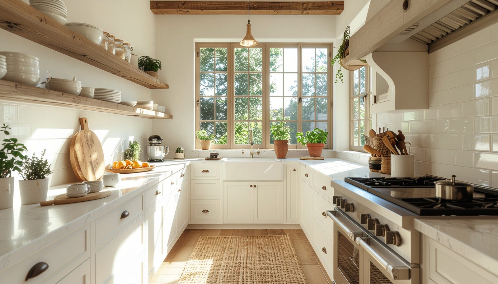
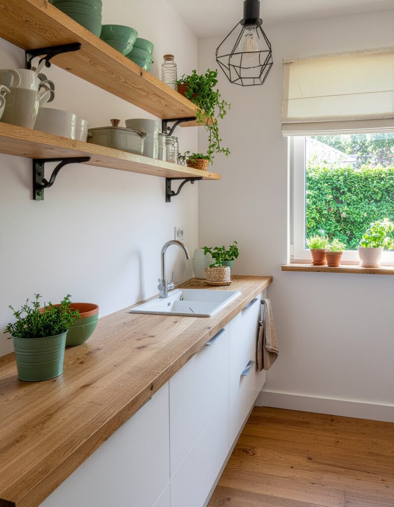
Open Shelving for a Bigger and Brighter Feel
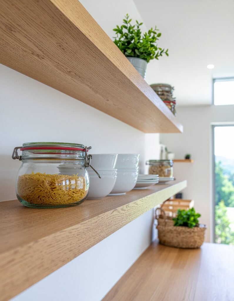
Heavy upper cabinets are usually what makes a kitchen feel like a corridor. Solid doors run in an unbroken line at eye level, and the room reads smaller than it actually is.
Taking the doors off one or two upper cabinets is the fastest version of this fix. Unscrew the hinges, fill the hinge holes with wood filler, sand lightly, then paint the inside of the cabinet box. Painting the interior a shade lighter than the exterior, or matching it to the wall color, makes the opening recede so the contents stand out.
If you would rather mount real shelves, keep them 8 to 10 inches deep so plates sit flat without crowding the counter, and anchor into studs rather than drywall alone. Two shelves spaced roughly 14 inches apart hold everyday dishes comfortably.
Styling is where most people slip. Group by color and material instead of by function. Stack plates in short piles, stand a few mugs beside them, add one glass canister and one small trailing plant. Leave about a third of every shelf empty. A shelf packed wall to wall reads as storage. A shelf with breathing room reads as design.
One practical caution: skip open shelving directly beside a gas range if you fry often, since airborne grease settles on everything within a few feet.
The Right Lighting to Set the Mood
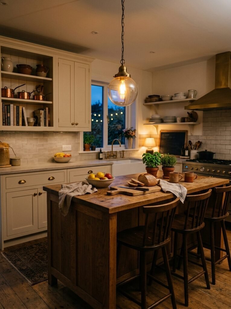
One ceiling fixture doing all the work is the most common reason a kitchen feels cold. Flat overhead light flattens texture, drops your own shadow onto the counter you are working on, and leaves the room with no mood after dark.
Good kitchen lighting runs on three layers. Ambient light fills the room. Task light covers work zones, usually LED strips under the cabinets aimed at the counter. Accent light handles atmosphere, whether that is a pendant over the island or a small lamp tucked on a counter corner. If you have an island or a table, that pendant is the highest impact addition available: hang it 30 to 36 inches above the surface, and if you are running two or three, space them 24 to 30 inches apart and center the group on the counter rather than on the ceiling.
Bulb color matters as much as the fixture. Lower Kelvin numbers read warm and yellow while higher numbers read white or blue, and ENERGY STAR bulb guidance places the 2200K to 3000K range in the warm, incandescent-style band and 3500K to 4100K in noticeably whiter territory. Use warm bulbs over the island and dining zone, something slightly cooler above prep areas, and never mix two different temperatures in the same sightline.
Put whatever you can on a dimmer. Aged brass, rattan, unlacquered brass and matte black all read warmer than chrome. Renters get most of the same effect with plug in sconces, rechargeable puck lights under the cabinets and a swag hook that repositions a corded pendant without touching the wiring.
Wood Accents to Add Warmth
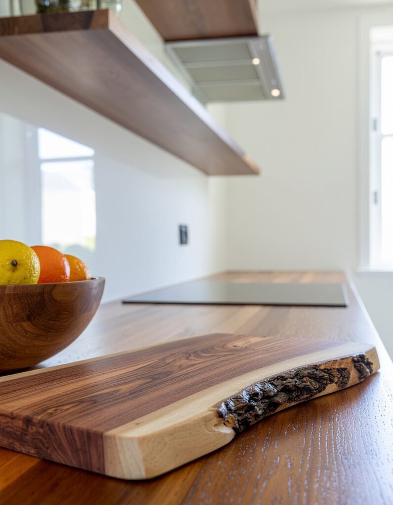
Sterile kitchens are usually all hard surfaces: stone, laminate, painted MDF, stainless steel. Every one of those bounces light back and gives nothing in return. Wood is what breaks the pattern.
You do not need new counters or a new island. Start with one large end grain board leaned against the backsplash, ideally 18 inches wide or more so it registers as a feature rather than clutter. Add a shallow wooden fruit bowl, a spoon crock in beech or olive wood, a stool with a wooden seat, or a single floating shelf.
Two rules keep it from looking accidental. Limit the room to two wood tones, and let them relate to the floor without matching it exactly. A warm oak board over cool gray flooring looks deliberate. Five different species scattered across one counter looks like a thrift haul.
Upkeep is what keeps wood looking expensive. Wash boards by hand, never let them soak, and rub in food safe mineral oil about once a month. Dry, gray, cracked wood drags a kitchen down faster than having no wood at all.
Greenery to Bring the Space to Life
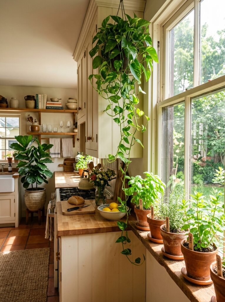
Plants do something no accessory manages: they signal that the room is looked after. A kitchen without a single living thing reads static no matter how well the finishes were chosen.
Match the plant to the light you actually have. South and west facing sills handle basil, thyme and oregano. Rosemary wants strong light and sharp drainage, since it rots in soggy soil. Mint takes over anything it shares a pot with, so give it its own container. If your window light is weak, skip herbs and reach for pothos, heartleaf philodendron, or a snake plant for the dark corner nobody knows what to do with.
Placement does the visual work. Pothos trailing from the top of a cabinet softens the hard line where cabinetry meets ceiling. Three small terracotta pots in a row on the sill look composed rather than random. A glass bottle holding a cutting in water beside the sink costs nothing and looks quietly considered.
Keep pots out of the working triangle so they never become an obstacle, use terracotta with a saucer underneath for drainage, and test moisture by pushing a finger an inch into the soil instead of watering on a fixed schedule.
A Backsplash That Actually Makes a Statement
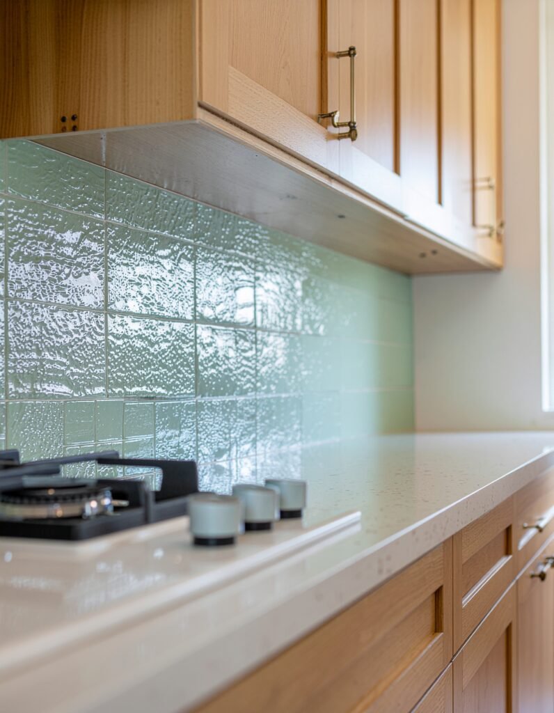
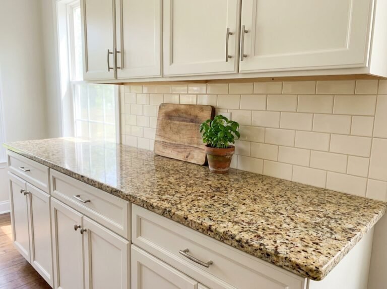
Four inches of leftover countertop stuck to the wall is the default builder backsplash, and it contributes nothing. This is the largest vertical surface at eye level in the room, which makes it the highest impact surface you own.
Zellige leads the field for good reason: the handmade glaze varies tile to tile and catches light unevenly, so a flat wall gains movement. Stacked square tile reads calm and modern. Scallop and fish scale shapes soften boxy cabinetry. Deep green or oxblood subway tile with dark grout gives a graphic, tailored look. Terracotta brings warmth that pairs naturally with wood and cream cabinets.
Grout is half the decision. Matching grout keeps the wall quiet and lets the tile shape carry the design. Contrasting grout turns the same tile into a pattern you notice from the doorway. Sample both before committing, because the difference is dramatic.
Two practical notes. Run the tile full height behind the range instead of stopping at the standard 18 inches, since that panel becomes the focal point of the room. And order 10 to 15 percent above your measured square footage to cover cuts, breakage and future repairs.
Renters have real options now. Modern peel and stick gel tile has genuine depth and convincing grout lines. Degrease the wall thoroughly first, press each piece from the center outward, and keep it clear of the zone directly behind gas burners where heat loosens adhesive.
Organized Counters With Matching Jars and Canisters
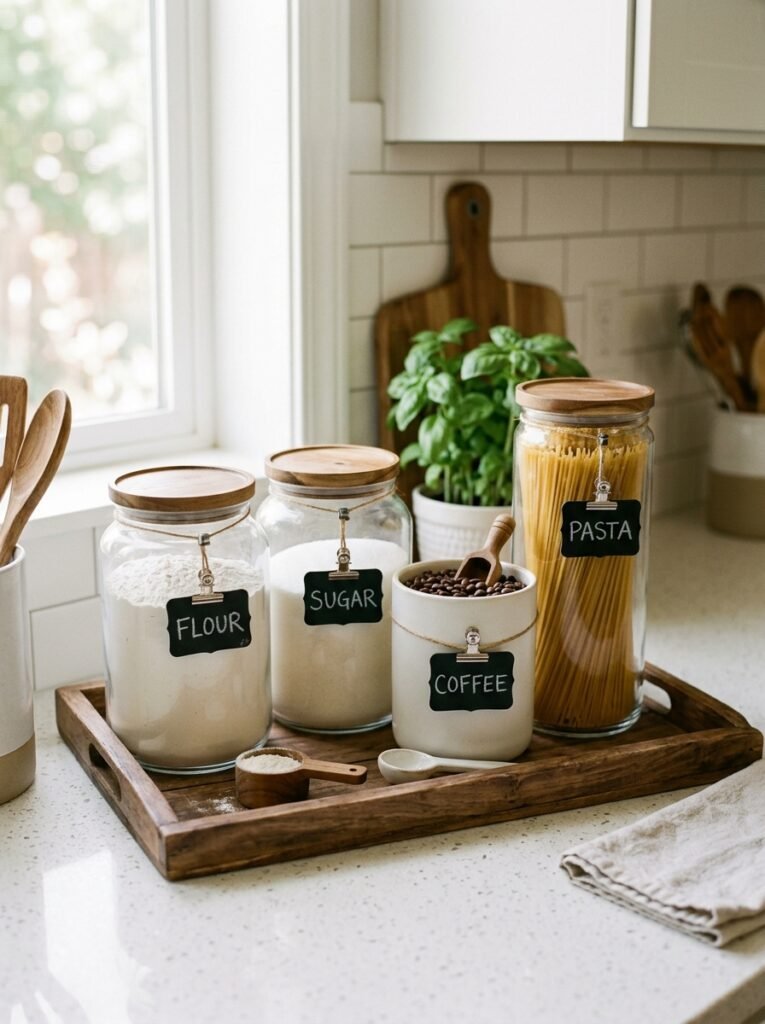
Visual noise reads as mess even when the kitchen is spotless. Ten packages in ten brand colors will beat any amount of beautiful tile.
Decanting fixes it in an afternoon. Move flour, sugar, rice, pasta, coffee and oats into matching glass jars or ceramic canisters with airtight lids. Uniform shape matters far more than an expensive brand. Set the group on a wooden tray or slate board so it reads as one object rather than six. Label with a single method: small chalk tags, printed labels in one font, or nothing at all when the contents are obvious.
Here is the step most people skip. Cut the expiry date and cooking instructions off the original packaging and tape them to the underside of the lid. You keep the information without keeping the graphics.
Then apply a hard rule to the rest of the counter. Anything used less than daily goes into a cupboard. One appliance stays out, two at the absolute most. Utensil crocks hold only the tools you reach for weekly, not the entire drawer. Decant dish soap into a plain pump bottle and give the sponge and brush a small dish of their own.
The whole change costs almost nothing, which is exactly why it belongs near the top of any list of kitchen upgrades that work on a small budget.
A Color Palette That Ties Everything Together
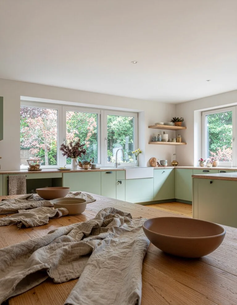
A kitchen that feels random is almost always a kitchen with no color rule. Towels in one family, bowls in another, packaging in a third, appliances in a fourth.
Build the palette from what you cannot change. Look at the counter, the floor and the cabinet color, pull two or three shades that already live there, and treat that as the whole set. Then work to something close to a 60/30/10 split: a dominant neutral across large surfaces, a secondary tone on cabinetry and textiles, and an accent used in small doses.
The accent only works when it repeats. Show it at least three times, in different spots and at different heights: a towel on the oven handle, the lids of your canisters, a bowl on the open shelf, the spine of a cookbook. Repetition is what separates a composed room from a decorated one.
Metal counts as a color. Choose one dominant finish, brass or black or brushed nickel, then allow one supporting finish in smaller pieces. Two metals look intentional. Four look accidental.
Combinations that hold up over time: cream, terracotta and sage for warmth. Charcoal, warm white and brass for something sharper. Oat, rust and black for a modern look with weight. Pick one, then edit out whatever fights it.
Cookware That Doubles as Decor
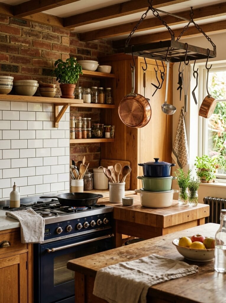
Cookware hidden in a cabinet is storage. Cookware left out on purpose is decoration that also works for a living.
The pieces that earn counter space are the ones with material presence: cast iron, an enameled Dutch oven in a color from your palette, copper, brass or stoneware. A single skillet resting on the stove is plenty in a small kitchen. A larger room can carry a wall rail with S hooks beside the range, or a ceiling rack, which has to be anchored into joists rather than drywall.
Display only what you cook with weekly. Anything left out and unused collects grease and dust within a month, which looks worse than an empty stovetop. That also rules out worn nonstick and scratched pans, which show every flaw under direct light.
Keep the finishes right. Dry cast iron on a warm burner and wipe it with a thin film of oil, avoid abrasive scrubbing on enamel, and either polish copper occasionally or let it patina on purpose. A full matching set was never the goal. One or two good looking pieces, placed deliberately, do the entire job.
A Coffee or Tea Corner With Its Own Identity
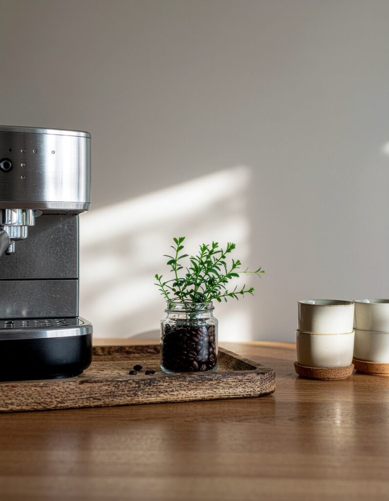
A machine plugged into whatever outlet happened to be closest is not a coffee station. Giving that corner a defined edge is one of the cheapest ways to make a kitchen feel designed, and it is the first thing you see every morning.
Define the zone first. A tray, a butcher block section or a marble board under the machine draws a visible boundary. Everything inside that boundary belongs to the ritual. Everything else moves out.
Build it around daily use: the machine, a canister of beans or a tin of loose leaf, a grinder, one stack of matching mugs, a spoon rest. Add height with a narrow shelf or a row of hooks above the counter for mugs, which clears surface space and turns the mugs themselves into part of the display. A small plant, a linen cloth and one framed print finish it.
Where counter space is tight, move the whole setup onto a rolling cart or into a cabinet fitted with a pull out shelf, and confirm the outlet placement works before you commit. Store beans in an airtight, opaque container, since light and air stale coffee faster than time does.
Textiles That Make It Feel Like Home
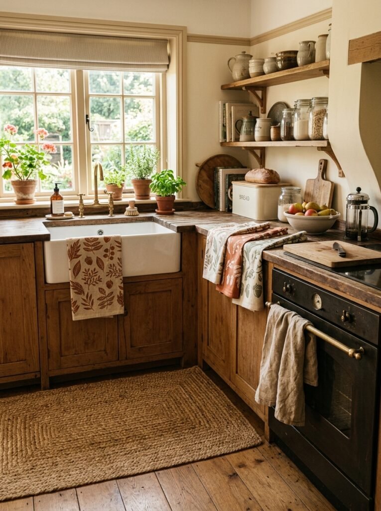
Kitchens are built from the hardest materials in the house. Stone, glass, tile, metal and laminate all bounce sound and light, which is why so many of them feel echoey and cold regardless of how good the finishes are. Fabric is the correction, and it is the layer most people forget completely.
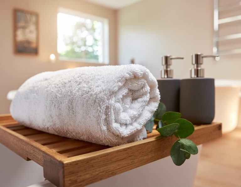
Start with towels, since they are the cheapest change available. Washed linen and waffle weave cotton drape well, dry quickly and look better rumpled than terry, which pills and snags on hardware. Buy two sets in your palette colors and rotate them so one is always clean.
Add a runner or small rug where you stand longest, usually the sink and the main prep counter. Flat weave cotton is washable and the safest choice near water. Jute brings texture but traps crumbs and dries slowly, so keep it in a dry zone if you love the look.
Windows deserve attention too. A cafe curtain on a tension rod or a simple Roman shade in a small print softens the hardest corner of the room without cutting the working light. Cushioned seat pads on stools do the same job at seat height.
Stay with natural fibers in colors already used elsewhere in the room. Linen, cotton and jute age well, photograph well and mark the difference between a kitchen that functions and one you want to spend time in.
None of this needs a renovation. It needs you to identify what is actually missing and fix that one thing properly instead of fixing five things halfway.
Start with the layer that is most obviously absent. If the room feels cold, begin with lighting. If it feels sterile, begin with wood and textiles. If it feels chaotic, clear the counters first, because nothing you add will register until the visual noise is gone. Handle one properly and the next fix becomes obvious. Work through the rest of our kitchen decor ideas when you are ready for the next layer.