10 Chic Dining Room Ideas You Need to Copy Right Now
A dining room either pulls people in or it does not, and the difference is rarely the budget. It comes down to three decisions. The style you commit to, the palette you repeat, and whether the furniture is sized correctly for the room.
That last part is where most dining rooms quietly fail. A gorgeous table in the wrong dimensions turns every meal into a shuffle. So each of the ten styles below comes with its defining materials, a workable palette, and the measurement that makes it function.
Pick the one that matches how you actually eat, then borrow the numbers.
Boho Chic Dining Room
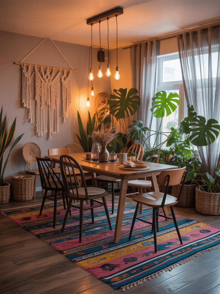
Bohemian style runs on collected texture rather than matched sets. Layer two rugs of different weaves and mix chair styles around one table. Let deep colors sit against neutral walls so the room reads warm instead of chaotic.
The signature materials are easy to find secondhand. Rattan, jute, macrame, unglazed ceramics, aged brass, and baskets used as storage rather than decoration. Plants do the rest. Trailing pothos on a shelf and a large fiddle leaf in the corner cost less than most light fixtures.
Here is the rule that keeps layered rugs from becoming a trip hazard. Any rug under a dining table needs to extend 24 to 36 inches past the edge on all sides. Chairs have to stay on it when pulled out. Layer the smaller, more decorative rug on top of a larger flatweave base, not the other way around.
Mismatched chairs work when one element ties them together. Pick a shared color, a shared wood tone, or a shared seat height, then vary everything else.
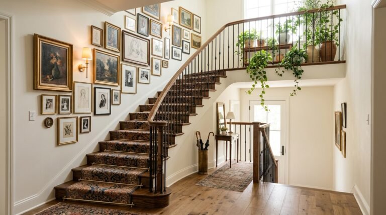
The walls deserve the same attention as the table, and these wall decor ideas for every room carry that eclectic energy upward.
Sleek Minimalist Dining Room
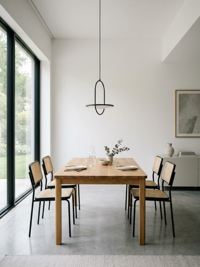
Minimalism is not an empty room. It is a room where every object had to earn its place. That makes it the hardest style here to execute cheaply. With nothing to hide behind, quality shows.
Spend the budget on one thing. A sculptural pendant, a table with genuinely beautiful grain, or a set of well made chairs. Then keep everything around it quiet: one tone on the walls, no gallery wall, no centerpiece beyond a single bowl or stem.
Size that statement light properly, since it carries the room. A common approach is to make the fixture roughly half to two thirds the width of the table. Hang it 30 to 36 inches above the tabletop with a standard 8 foot ceiling. Add around 3 inches for every extra foot of ceiling height.
Storage is what makes or breaks the look in daily use. A sideboard with doors, not open shelves, gives clutter somewhere to disappear.
Watch the temperature of the palette. Pure white and cool gray can read clinical in a room meant for eating. Warm whites, oatmeal, and a single wood tone keep it calm rather than cold.
Antique Elegance
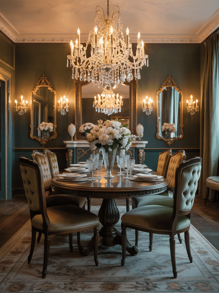
Antique style has one advantage nothing else on this list can match. Solid wood furniture from the early twentieth century often costs less secondhand than new flatpack, and it is built to outlast it.
The core pieces: an ornate wood table, button backed chairs, a glass fronted cabinet, and a chandelier with real presence. Estate sales and auction houses beat antique shops on price by a wide margin.
Condition is what separates timeless from tired. Wax solid wood twice a year rather than using silicone polish, which builds up a cloudy film. Loose joints on old chairs are usually a straightforward reglue rather than a reason to walk away. Reupholstering two dining chairs costs far less than most people assume.
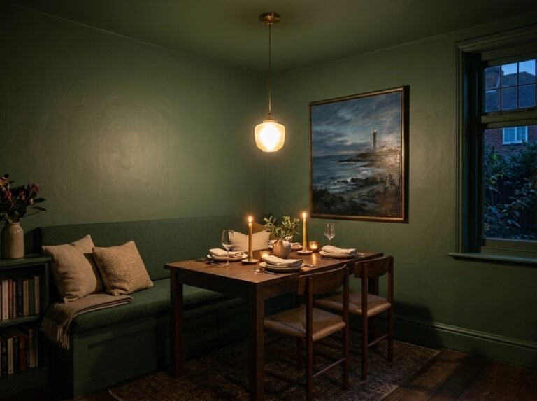
Hang the chandelier 30 to 36 inches above the table. Higher than that and the room loses its focal point. Fit dimmable warm bulbs, because bright light flattens the detail these rooms are built around.
One counterweight keeps the style from feeling like a museum. Add something living and current: fresh flowers, a modern piece of art, or plain linen napkins against the formal china.
Rustic Warmth
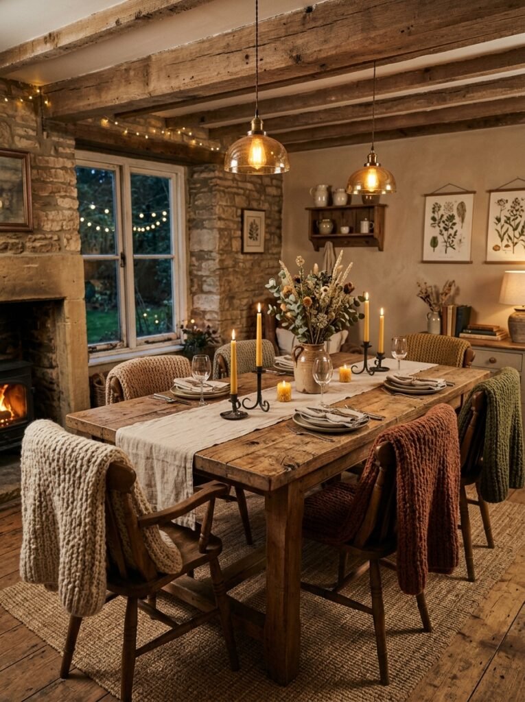
Rustic works because it forgives everything. Marks in the wood become character rather than damage, which makes it the most practical choice for a household with children.
Build it around a solid reclaimed wood table with visible grain, knots and saw marks. Add chairs or a bench in a contrasting tone, with knit throws over the backs. Use stoneware rather than porcelain, and blackened metal for hardware and lighting.
Size the table by the people, not the room. Allow 24 inches of table edge per person. A 72 inch rectangular table seats six comfortably. A 60 inch round seats six with less elbow room but works better in a square space.
Leave 36 inches minimum between the table edge and the nearest wall. Make it 42 to 48 inches where people walk behind seated guests.
Finish matters for daily use. An oiled or waxed top can be repaired in place with fine sandpaper and more oil. A polyurethane finish resists spills better but shows scratches permanently. Choose based on how much wear the table will actually take.
Art Deco Glamour
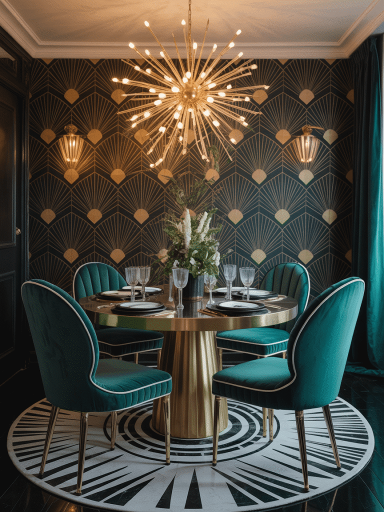
Art Deco is the most theatrical style here, and it rewards restraint far more than enthusiasm.
The vocabulary is specific. Geometric pattern, high shine brass or chrome, lacquered and mirrored surfaces, velvet upholstery, and jewel tones like emerald and oxblood. The style peaked at the 1925 Paris exposition that gave it its name. As The Met notes in its essay on French Art Deco, ornament used with real confidence was the defining characteristic of that moment.
Confidence is not the same as volume. Choose one element to carry the drama and keep the rest supporting. A geometric wallpaper on a single wall, or a fan backed velvet chair, or a bold fluted sideboard. All three at once turns a dining room into a stage set.
Lighting does the heavy lifting. A tiered or globe chandelier in brass reads Deco instantly, even in an otherwise plain room.
The affordable entry point is small. Brass candlesticks, a mirrored tray, patterned napkins and coupe glasses give you the flavor for very little, long before you commit to furniture.
Coastal Calm
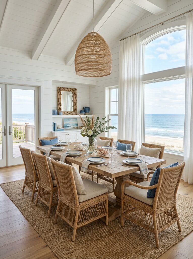
Coastal style has one failure mode: it slides into theme decor. Rope, anchors and shell motifs are what separate a coastal dining room from a seafood restaurant.
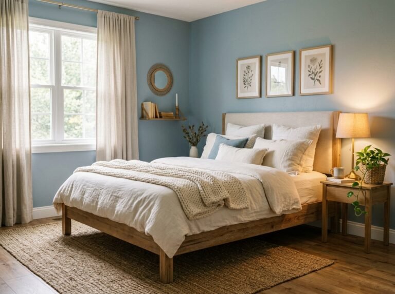
Get the palette right and skip the props entirely. Soft blues, warm whites, pale sand, and driftwood gray. Bring in texture instead of imagery through linen slipcovers, jute or sisal underfoot, rattan chair backs and unlacquered wood.
The cool tones need a counterweight or the room feels chilly, especially in a north facing space. Warm wood on the table or floor does that job. So does a natural fiber rug and unbleached linen at the windows.
Light is the whole point of this style. Keep window treatments sheer or roll them fully clear of the glass. If the room is genuinely dark, a large mirror opposite the window pushes daylight further in.
Linen is the practical detail. Washed linen softens with every wash and looks better crumpled, which suits a room in constant use. Buy two sets of napkins and a runner so one is always clean, and skip anything requiring an iron.
Nordic Inspired
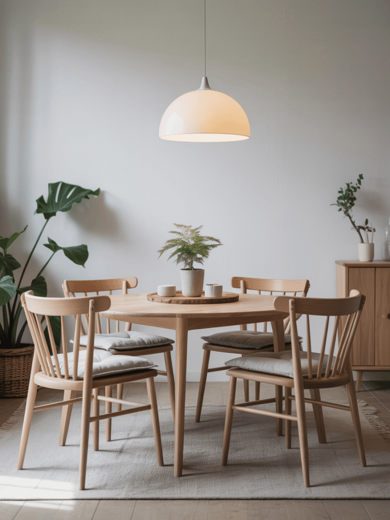
Scandinavian design solves a specific problem: how to keep a room bright and calm through long dark winters. That is why it travels so well into small or poorly lit dining rooms.
The palette is restrained. Warm white walls, pale birch or ash wood, soft gray textiles, and black used sparingly as a graphic accent. One or two colors appear as small punctuation, never as a theme.
Function drives the choices. Chairs are comfortable enough to sit in for two hours. Storage is closed. Surfaces stay clear. Nothing decorative gets in the way of using the room.
Lighting deserves particular care, because a single ceiling fixture is what makes these rooms feel institutional. Layer a pendant over the table with a lamp on the sideboard and candles on the table itself. Use warm bulbs around 2700K throughout.
Clearance is generous in Nordic rooms by design. Keep 36 inches minimum around the table and resist filling the perimeter with furniture. The empty space is part of the look, not an unfinished job.
Industrial Edge
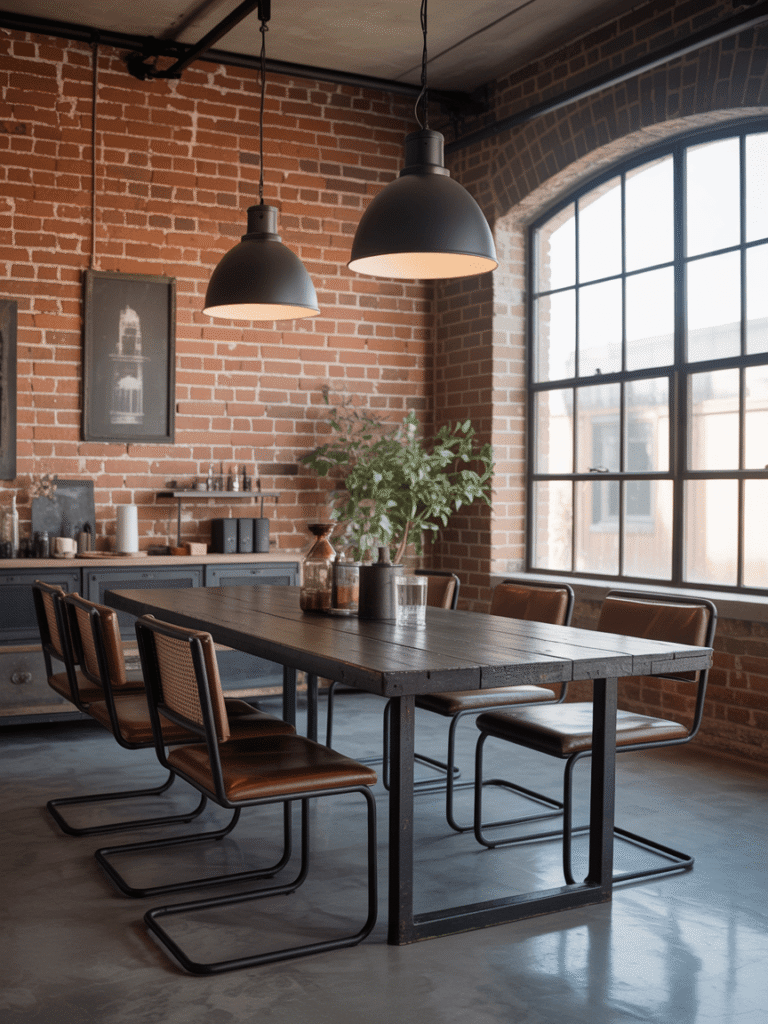
Industrial style is built on contrast. Rough brick against smooth steel, raw timber against black metal, hard surfaces against soft textiles.
That last pairing is the one people skip, and it is the reason so many industrial rooms feel unwelcoming. Brick, concrete, metal and glass all reflect sound. Without fabric to absorb it, the room echoes and conversation gets tiring. A rug, upholstered seats and heavy curtains fix it completely.
The signature pieces: a reclaimed wood table on a steel base, black metal pendants or a caged fixture, and open shelving in wood and pipe.
Renters and anyone without real brick have decent options. Brick slip panels, textured concrete effect wallpaper and limewash paint all give the surface quality without structural work.
Keep the metal finish consistent. Black and aged steel work together. Adding polished chrome or bright brass to the mix reads as accidental rather than layered.
One warm element stops the whole thing feeling like a warehouse. Amber Edison style bulbs, a leather bench, or a single large plant does it.
French Country Charm
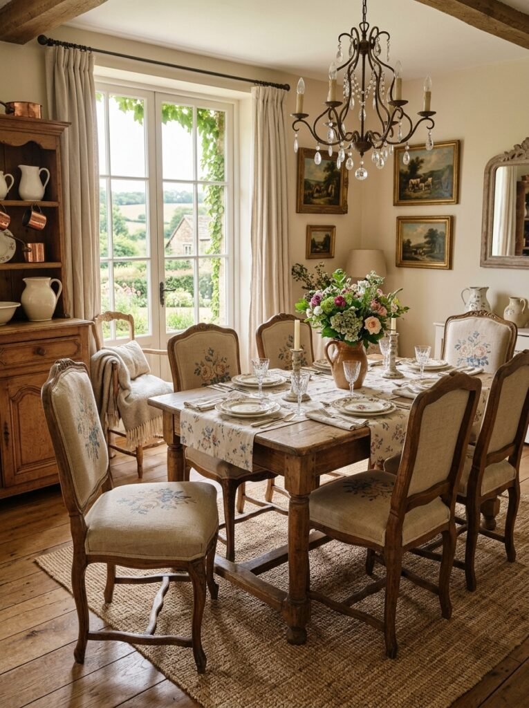
French Country is the softest style on this list, and the one most easily overdone. The fix is pattern scale.
Use three sizes of pattern and no more. One large scale floral, one small repeating print, and one plain texture. If everything in the room is a medium sized floral, the eye has nowhere to rest.
The palette stays gentle. Chalky whites, dusty blue, sage, faded rose and honey toned wood. Painted furniture in a soft finish belongs here, and a slightly worn edge is the point rather than a flaw.
The materials are almost all natural. Linen and cotton for seat covers and curtains. Rush or cane seating, stoneware and enamel, and flowers on the table.
A distressed finish is achievable at home. Chalk paint needs no priming or sanding. Lightly sand the edges afterwards to bring back the wood where wear would naturally happen. That single technique turns a plain secondhand sideboard into the anchor piece of the room.
Keep the tablecloth washable. This is a style built around long family meals, and precious fabric works against that.
Terracotta and Blue
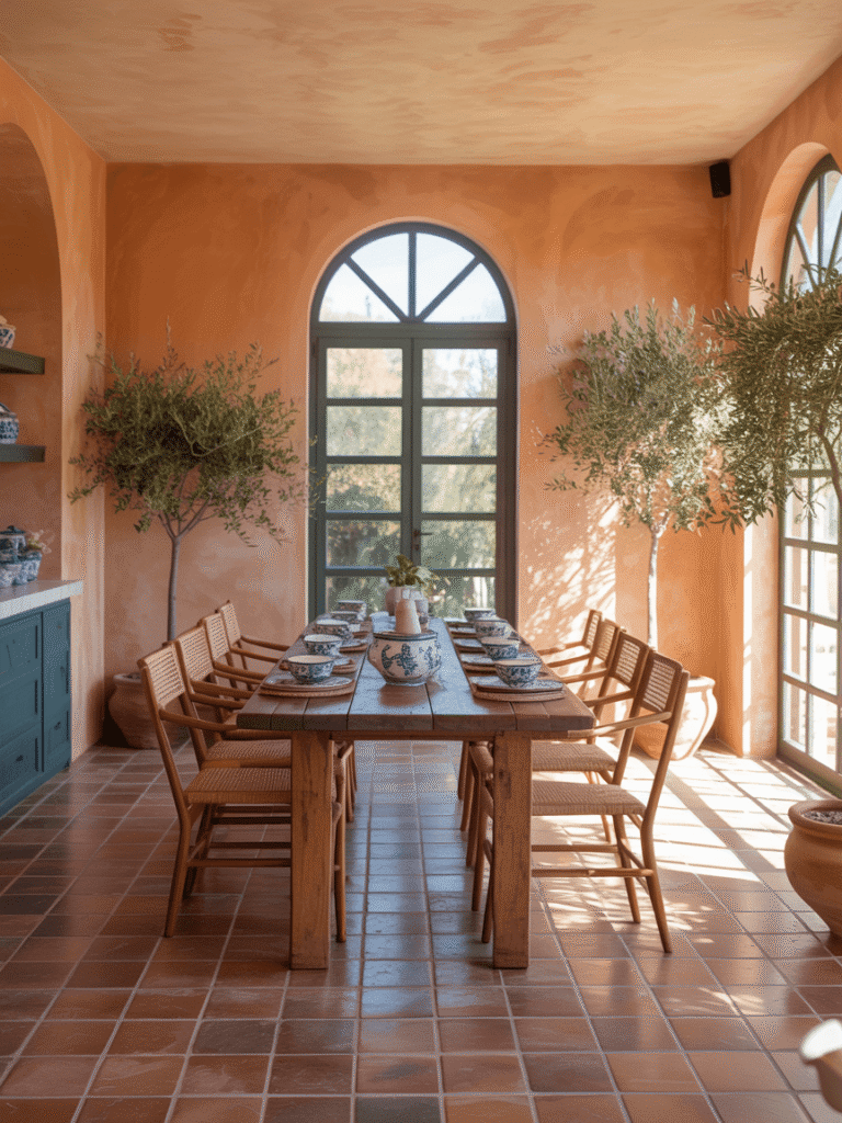
Terracotta and blue is a palette rather than a period. That makes it the easiest idea here to layer over a room you already have.
The proportion is what makes it work. Give terracotta the largest share across walls, floor tiles or a rug. Use blue as the accent in smaller doses, whether that is chair seats, ceramics or a single painted piece. Roughly 60 percent warm base, 30 percent neutral, 10 percent blue is a reliable starting point.
Materials keep it grounded: rattan, unglazed clay, linen, olive wood and plaster finishes. Deep azure or sapphire glazed ceramics carry the accent well.
Your dining room is more than a place to eat. It is where people gather, where stories get told, and where an ordinary evening turns into one worth remembering.
Whichever direction appeals, start with one change rather than ten. Get the table sized right for the room, hang the light at the correct height, and put the rug down. Those three decisions do more for a dining room than any amount of decorating. Everything else can follow at your own pace.