Modern Dining Room Decor Ideas for a Space That Is Not Really a Room
Two things in that phrase are usually wrong. Modern means something specific, and it is not a synonym for current. And most people searching for it do not have a dining room.
What they have is a table at one end of a living room. Or a corner of a kitchen. Or a rectangle of floor between a sofa and a set of patio doors. That changes nearly every decision, and almost none of the standard advice accounts for it.
Modern, Contemporary and Mid-Century Are Three Different Things
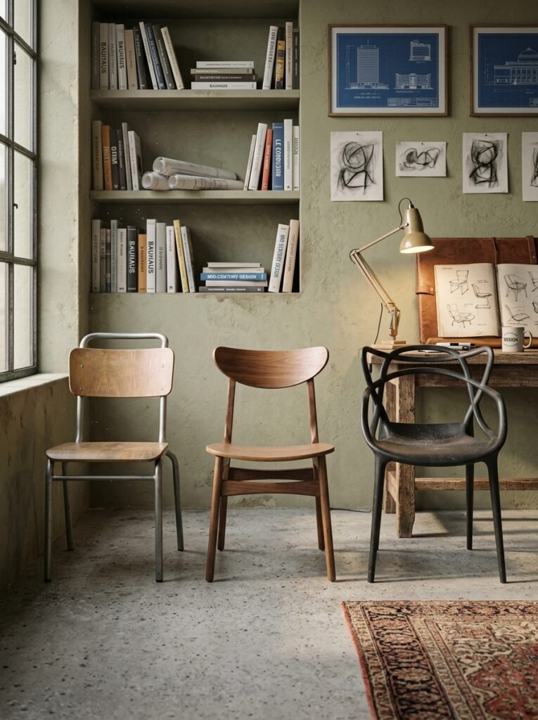
Ten seconds on this saves a lot of shopping. The three words get used interchangeably and lead to three very different rooms.
Modern is a historical movement, not a time period. Function ahead of ornament, honest materials, machine production taken seriously, decoration stripped back. It has been treated as a defined field for a long time. The Museum of Modern Art established the world’s first curatorial department devoted to architecture and design in 1932, and its collection traces those movements from the mid-nineteenth century forward.
Mid-century modern is a narrower slice of the same thing, roughly the 1940s to the 1960s. Tapered legs, warm wood, organic curves, low profiles.
Contemporary simply means what is being made right now. It has no fixed vocabulary, which is why it looks different every few years.
Mixing them is fine, and most rooms do. The trouble only starts when a room tries to be all three at once. A mid-century table, a high-gloss contemporary sideboard and a strictly functional chair, none of them talking to each other.
The practical consequence is worth knowing. Buying modern means buying into a defined set of rules that will still hold together in a decade. Buying contemporary means buying this year. Most people asking for the first actually want the second, and deciding which settles half the choices that follow.
Most Modern Dining Happens in a Corner of Another Room
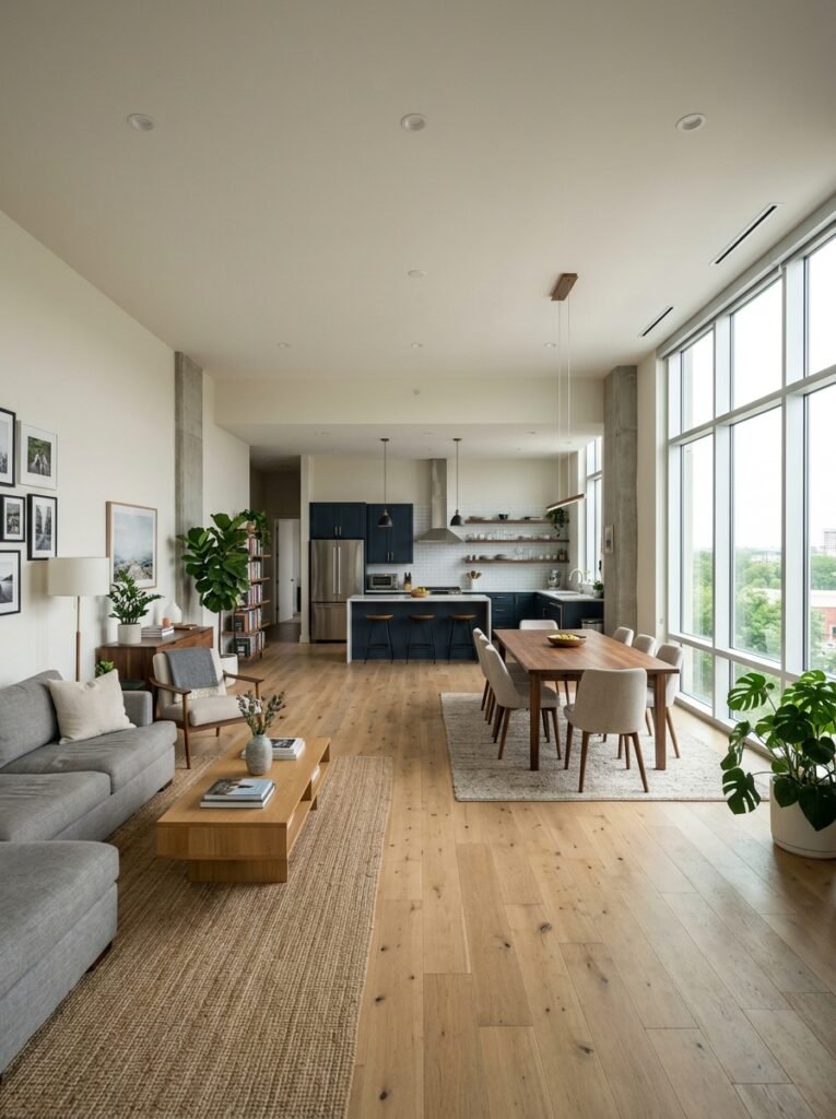
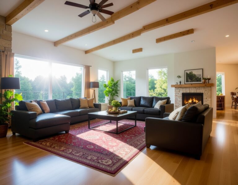
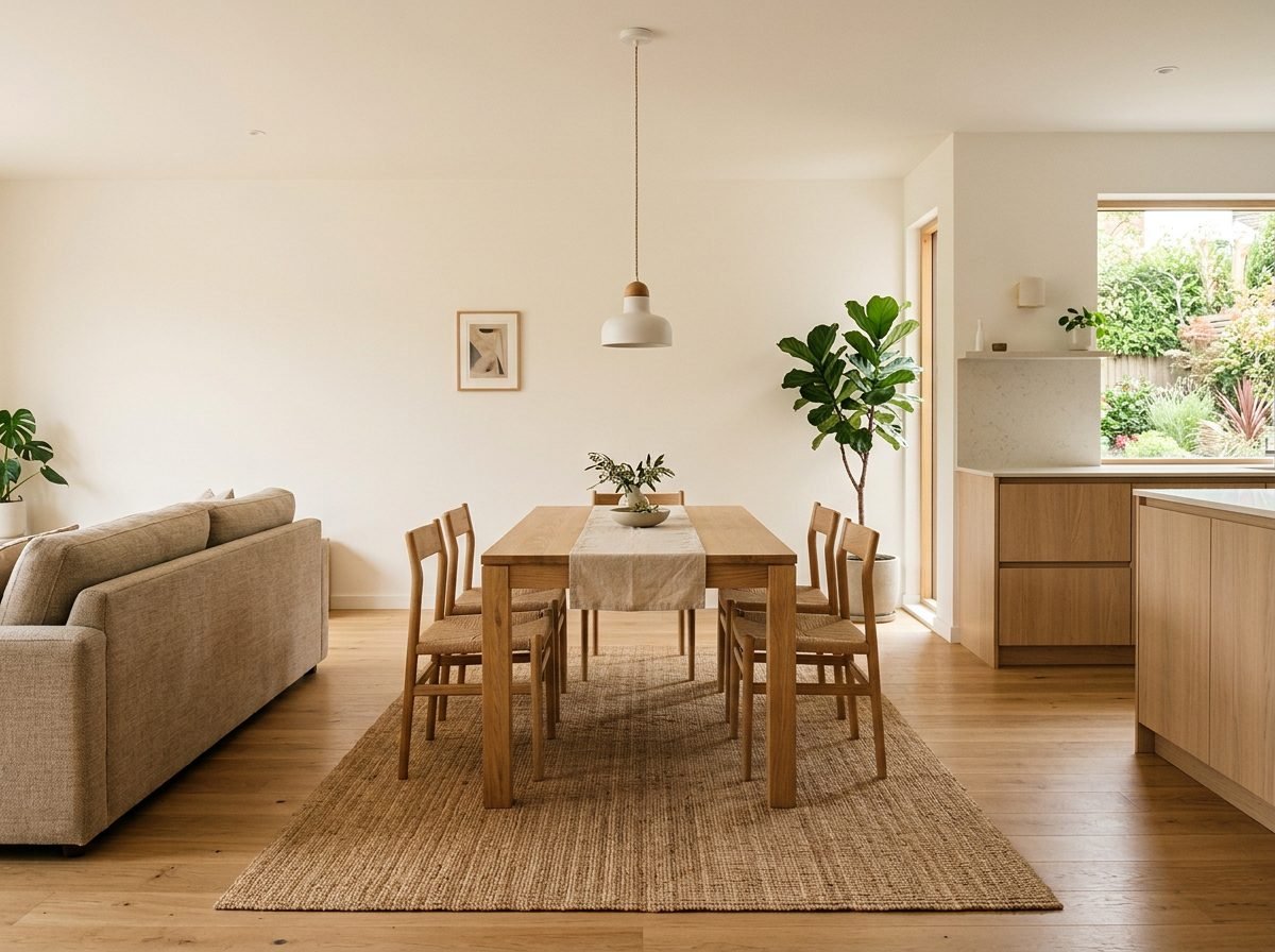
Separate dining rooms have been disappearing from new builds and apartments for years. What replaced them is a table sitting between a kitchen and a sofa, sharing light, floor and sightlines with both.
That single fact drives three consequences:
- Nothing has a wall behind it. Furniture gets seen from every side, so the backs of chairs and the undersides of tables stop being invisible
- Two functions compete for the same floor. Every inch given to dining is taken from living, and the traffic route between them has to survive both
- There is no door. The table is permanently on display, which is why clutter registers far more here than it ever did in a room you could close
None of that is a problem to be solved. It just means the job is defining a zone rather than decorating a room. Those are different tasks with different tools.
Drawing the Edges When There Are No Walls
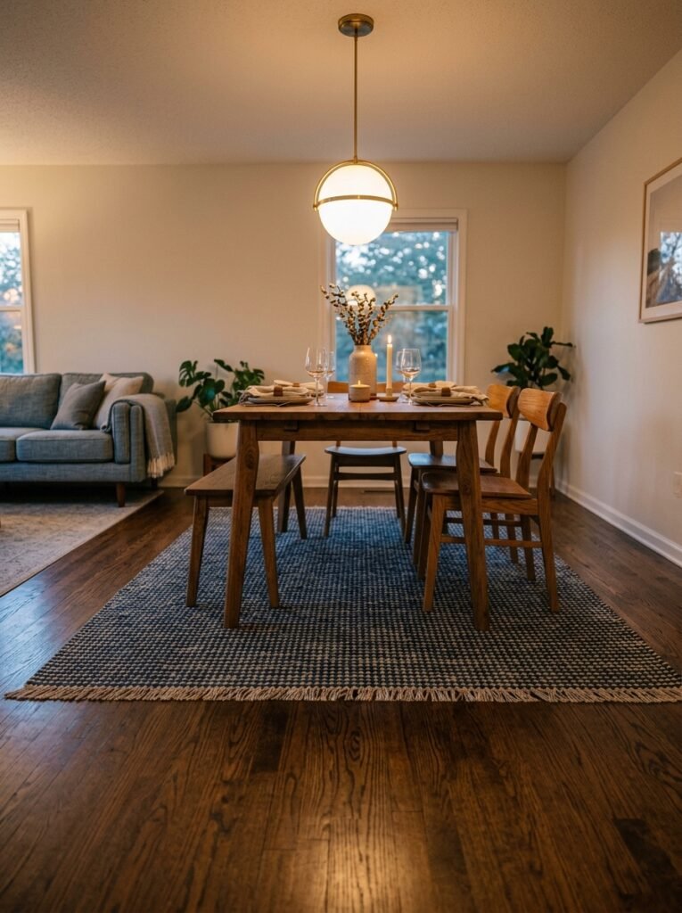
Four devices mark a dining zone, and two of them together is usually enough.
A rug. The clearest boundary available and the only one that says “this is a room” without building anything.
The light above the table. A pendant anchors the zone from the ceiling down, and it is the strongest single signal that the arrangement was deliberate rather than accidental.
A change underfoot. Tile giving way to wood, or a step in level, does the job permanently and needs no furniture at all.
The back of a sofa. Positioned as a low wall, it divides the two zones without blocking light or sightlines.
Whichever devices get used, leave the traffic route alone. In an open plan the path from the kitchen to the sofa usually runs straight past the table. A zone that blocks it gets resented within a week.
What tends not to work is anything tall. Screens and full-height shelving units fight the openness that made the layout appealing in the first place.
There are sizing figures behind all of this. How far a rug extends past the table, how high a pendant hangs, how much clearance the chairs need. Those are already worked through in this piece on ten dining styles and the measurements each one needs. No point repeating them here.
One thing does need saying though. Repeat something across the boundary. One metal finish or one wood tone carried into both zones is enough. Without it they read as two unrelated rooms sharing a floor.
The Table Answers to Two Rooms at Once
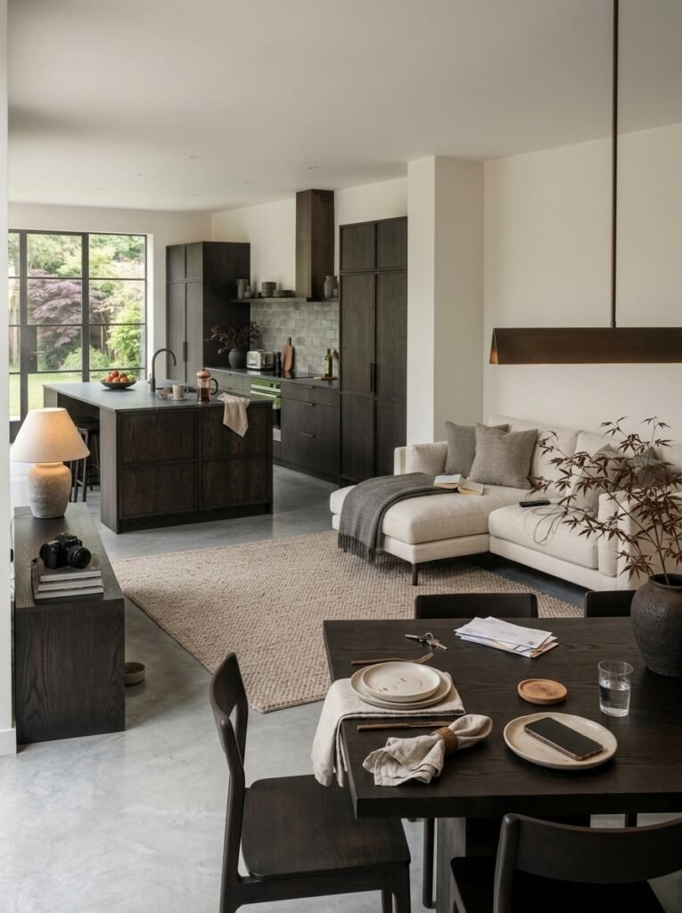
This is the genuinely hard part, and the one nobody warns about. The table has to sit next to a sofa and next to kitchen cabinets, and look intentional against both.
There are three workable approaches:
- Match the kitchen, contrast the living room. Pick up the cabinet tone or the worktop material in the table, and let the seating area do something else
- Match the living room, contrast the kitchen. This suits a kitchen in a strong color you cannot change
- Sit between them. A neutral wood or stone that belongs to neither, acting as a hinge
One rule prevents most of the failures here. Do not introduce a third wood tone. Two tones read as a scheme. Three read as an accident.
Table legs matter more in an open plan than in a closed room. The table gets seen from a distance and from the side. Four corner legs read lighter than a trestle or a heavy pedestal. Lighter is what keeps a dining zone from dominating a shared space.
Last check: look at the table from the sofa. That is the view for most of the evening, and it is the one nobody photographs.
Chairs Are Where It Falls Apart
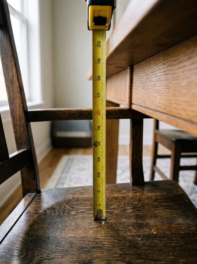
Dining chairs carry a set of dimensions that almost nobody checks before buying.
Allow roughly 10 to 12 inches between the top of the seat and the underside of the tabletop. Standard dining tables sit around 30 inches high, which puts a comfortable seat near 18. Anything outside that range leaves people either perched or reaching upward.
The apron is the rail running under the tabletop, and it decides whether chairs with arms can tuck in. Measure the arm height rather than the seat height. Then measure the gap from the floor to the underside of that rail. If the arms do not clear it, the chairs live permanently pulled out.
Armless chairs suit an open plan zone for that reason and one other. They read lighter from across the room, which matters when the chairs are visible from the sofa all evening.
Comfort deserves more thought in modern dining than in traditional. Molded plastic and bent plywood are the signature modern chair shapes, and they are also hard, cold and slippery. A zone used for long meals wants upholstered seats or seat pads. Failing that, a shaped shell rather than a flat one.
The backs also face the living area. That makes the back of a chair a visible design decision rather than a hidden one.
What the Table Does the Other Twenty-Three Hours
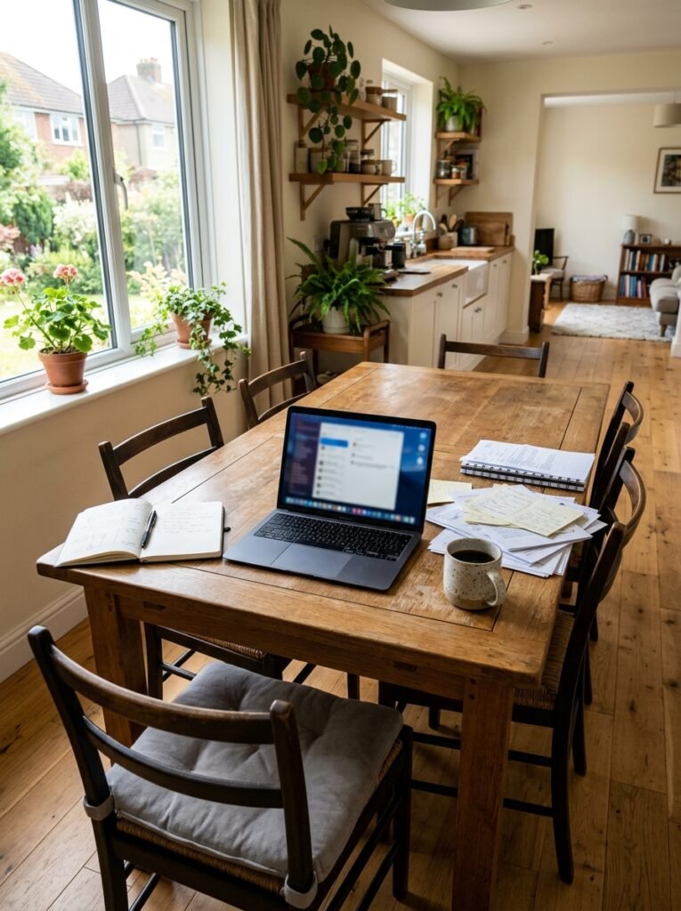
In an open plan home the dining table is usually the largest flat surface in the building. It becomes a desk, a homework station, a place to fold laundry and a spot to unpack shopping.
Choose the finish for that reality rather than for two dinner parties a year:
- Oiled or waxed wood can be repaired in place with fine sandpaper and more oil, which makes it the most forgiving over years
- Laminate and melamine wipe clean and shrug off heat, but chip at the edges and cannot be repaired
- Solid surface and stone are the most durable and by far the heaviest
- Glass shows every fingerprint and is the worst possible choice for a table that works for a living
Storage close by matters as much as the surface. A shallow drawer, a basket underneath or a console within reach changes everything. The table can be cleared in one motion rather than ten trips.
The aim is a table that looks fine bare. Anything that only works under a cloth is the wrong table for a room with no door.
Storage With No Dining Room Wall
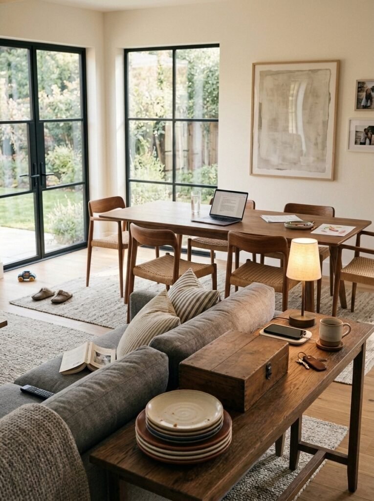
Traditional dining rooms come with a sideboard wall. Open plan zones frequently come with no spare wall at all. That is why dining storage ends up scattered through the kitchen.
Options, ordered by how little floor they consume:
- Wall-mounted cabinets or floating shelves, wherever a fragment of wall exists
- A narrow console behind the sofa, which earns its place twice by also drawing the zone boundary
- Kitchen cabinets reassigned to dining, which is what most households settle on
- A low sideboard on the shortest available wall, with closed fronts
It helps to know what dining storage actually has to hold. Table linens, serving dishes used a few times a year, candles, place mats. And in most households a couple of spare chairs. The chairs are the awkward part, since they need floor rather than shelf. Stacking or folding designs solve it. A pair can live as occasional seating in the living zone the rest of the time.
That last point is worth insisting on. Closed storage matters more in an open plan than anywhere else in the house. Open shelving in a permanently visible zone slowly becomes a display of everything you own.
Five Questions Worth Settling
Round or rectangular in an open plan? Round handles traffic better, since there are no corners to catch a hip, and it reads softer against a sofa. Rectangular seats more people per square foot and suits a long narrow zone.
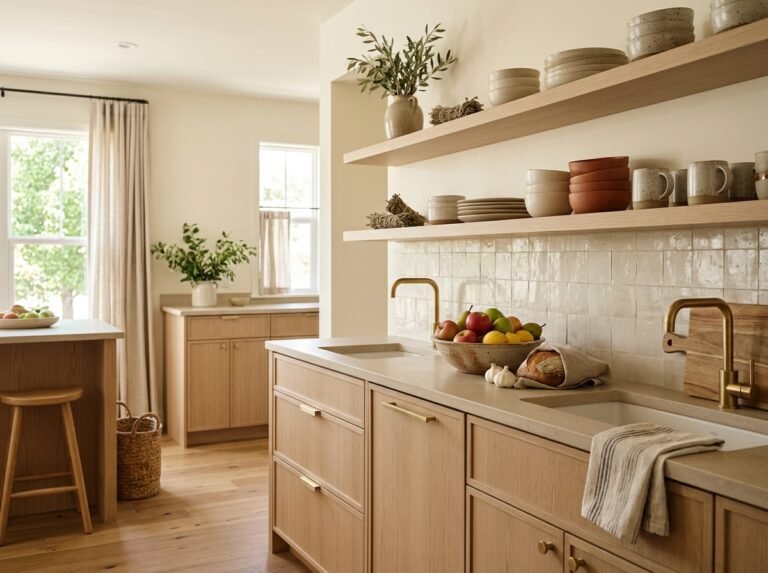
Does the dining zone have to match the kitchen? No, but it has to relate to it. Sharing one material or one finish is enough to make the two read as designed rather than adjacent.
How do I stop it feeling like a canteen? Warm light at table height rather than only overhead, something soft underfoot, and texture on at least one surface. Hard, flat and evenly lit is what reads institutional.
Bench or chairs? A bench tucks fully under and frees floor in a tight zone. It is also less comfortable for a long meal and awkward for whoever ends up in the middle.
What dates fastest? High-gloss finishes, very trend-specific chair silhouettes, and matched furniture sets bought as a single package. Sets in particular tend to age all at once.
Better a Good Zone Than a Bad Room
Nothing is gained by treating an open plan corner as a compromised dining room. It is a different thing with different rules, and it works well when those rules get followed.
A zone with clear edges, a light over the middle and chairs people can sit in for two hours works. It beats a formal room used twice a year.
Settle which of the three words you actually meant. Draw the edges. The rest is just furniture.